Aleus Consulting Group is a Regina-based advisory firm led by owner Brennen Schmidt, providing consulting services that help organizations navigate complexity at the intersection of leadership, governance, and technology. Aleus works with boards and executive teams to support informed decision-making during periods of change, growth, and transformation.
As the business continued to evolve, Brennen recognized the need for a brand refresh that better reflected the level of expertise and credibility Aleus brings to its work. The existing identity no longer captured the professionalism, confidence, and trust required to be taken seriously at the executive and board level.
The goal of this project was to create a refined, modern identity that clearly communicates Aleus’s role as a strategic partner. The refreshed brand needed to feel confident and enduring, positioning Aleus as a trusted advisor capable of helping organizations connect the dots and move forward with clarity in a fast-changing world.
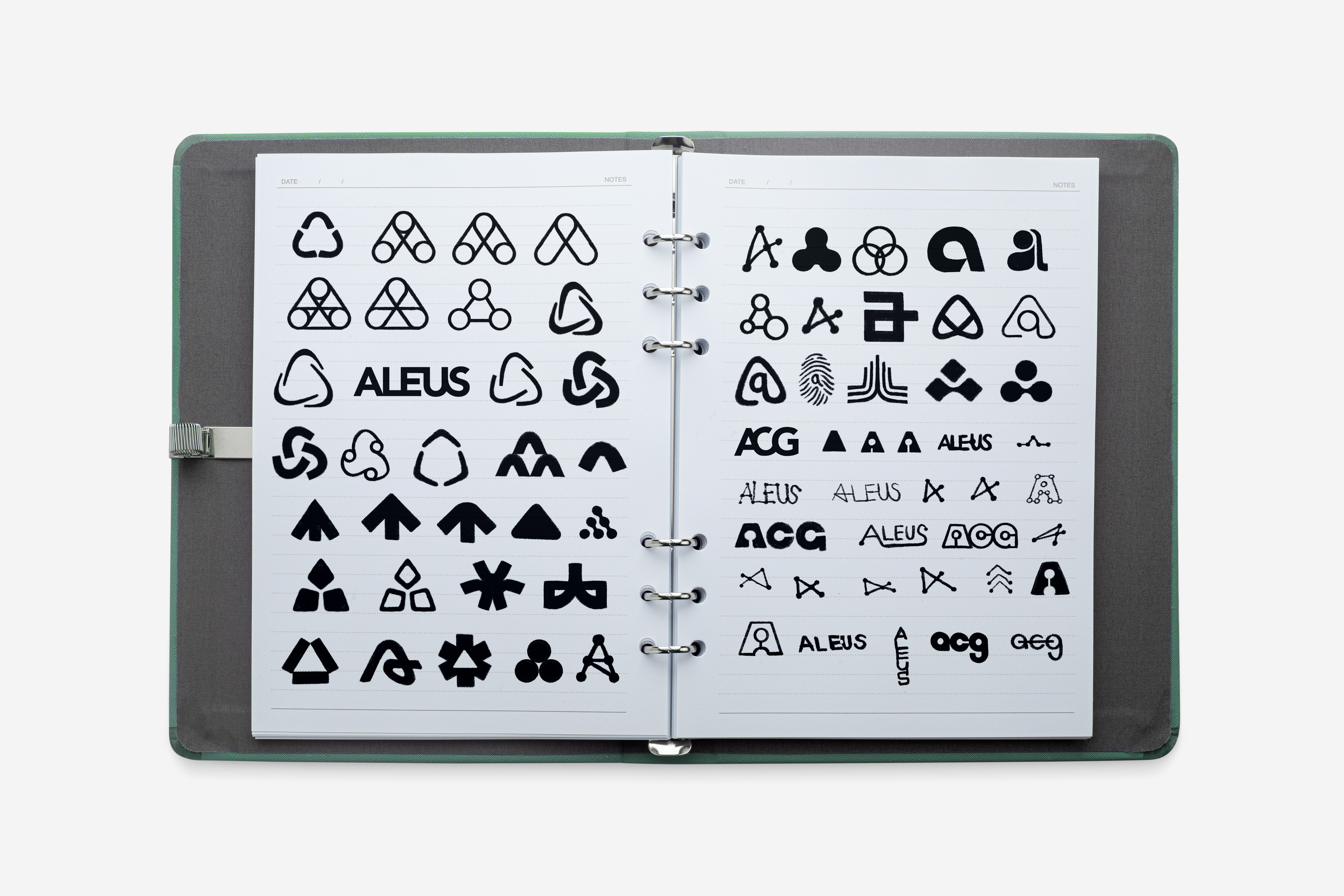
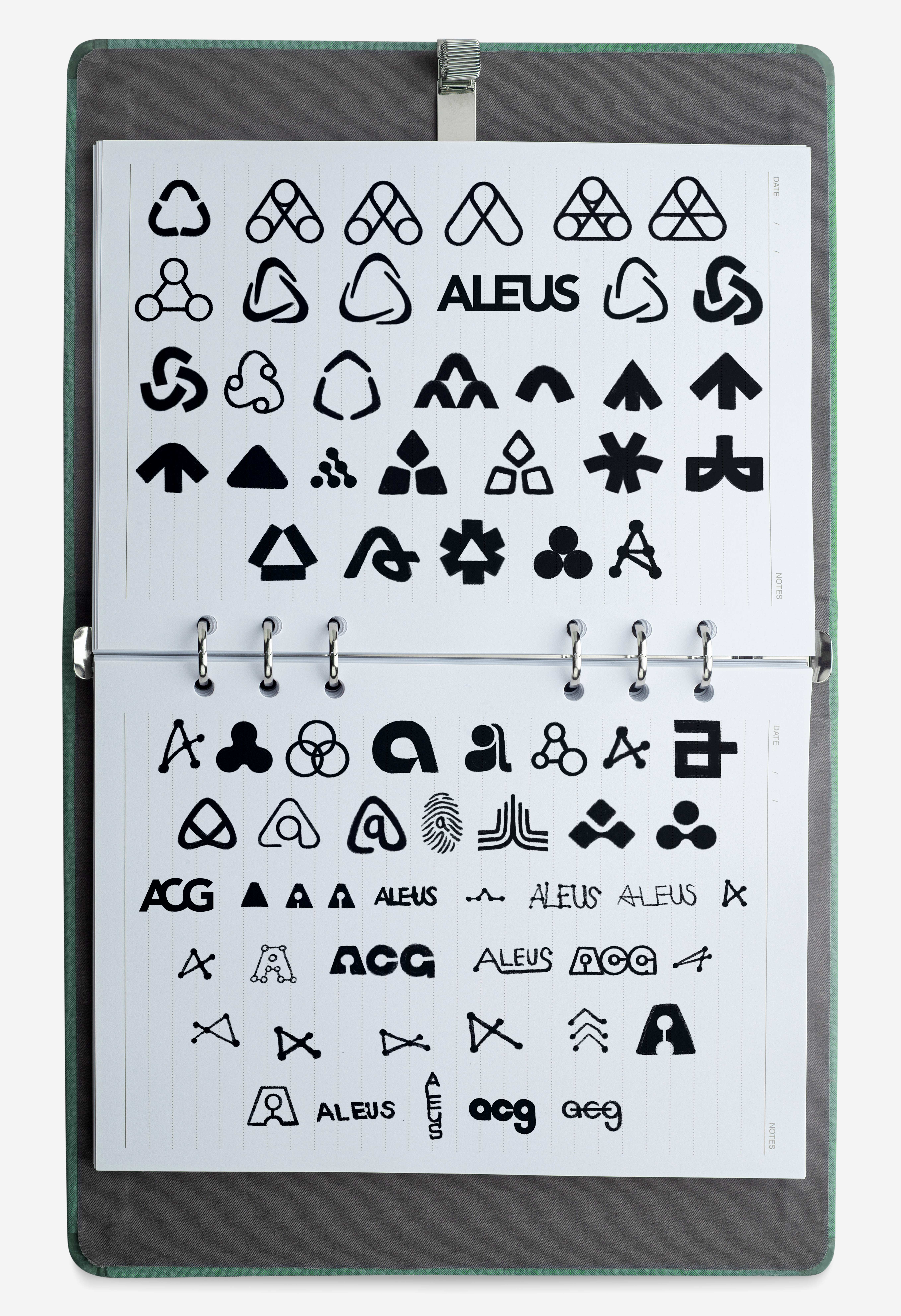


The sketching phase began with a wide exploration of abstract “A” concepts, reflecting Brennen’s instinct that the identity should centre around that form. Early ideas focused on directional, boomerang-like shapes that suggested connection, movement, and the back-and-forth relationship between Aleus and its clients. Through iteration, the focus shifted toward a more refined, rounded symbol that felt intentional, confident, and balanced, resulting in a mark that builds on the spirit of the existing identity while standing clearly and independently on its own.


The Aleus wordmark was designed to read as a single, flowing form, reinforcing the idea of connection and continuity. Subtle modifications allow each letter to transition naturally into the next, creating a distinctive silhouette without compromising clarity. The result is a wordmark that feels considered and cohesive, remaining highly legible across digital and print applications.


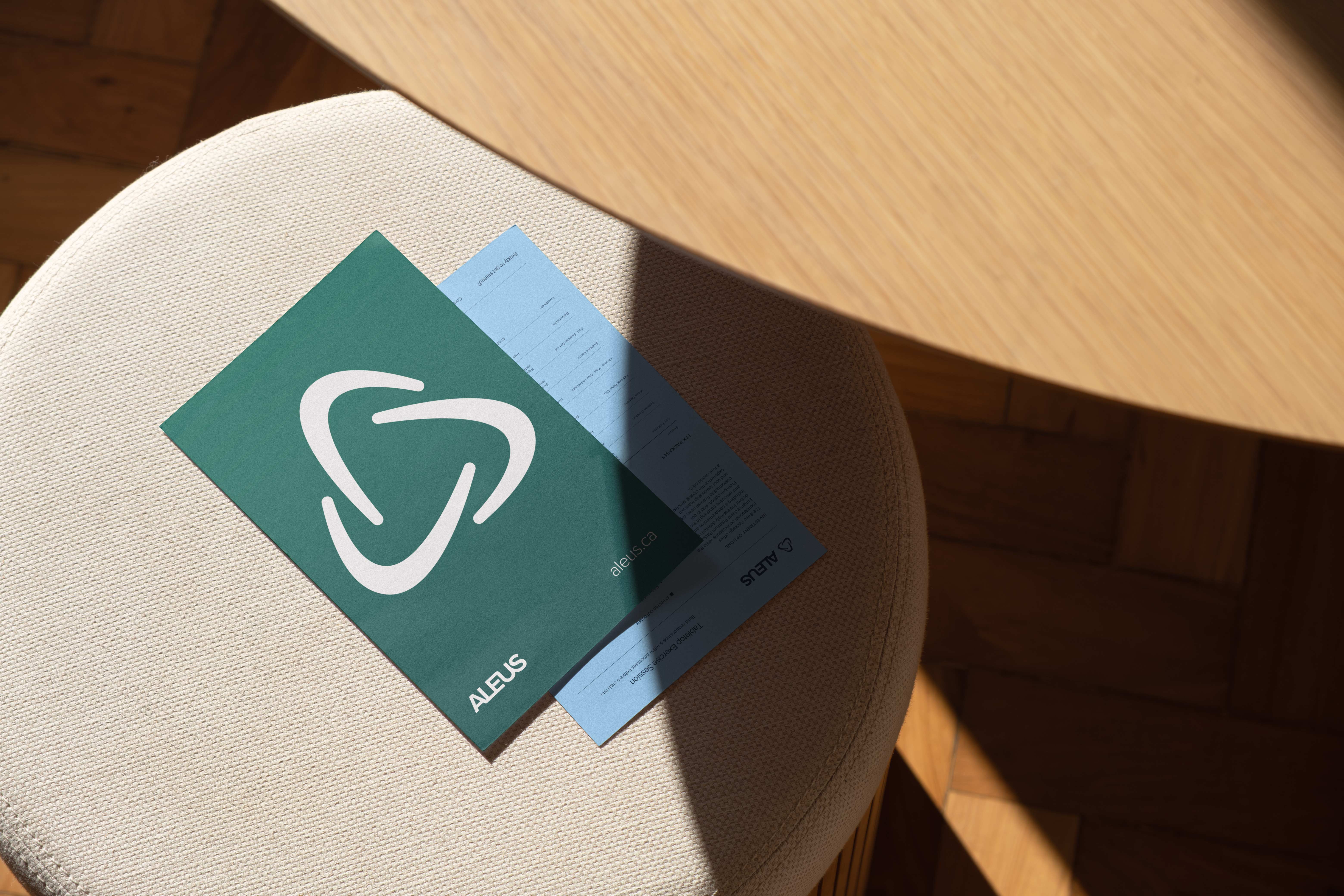
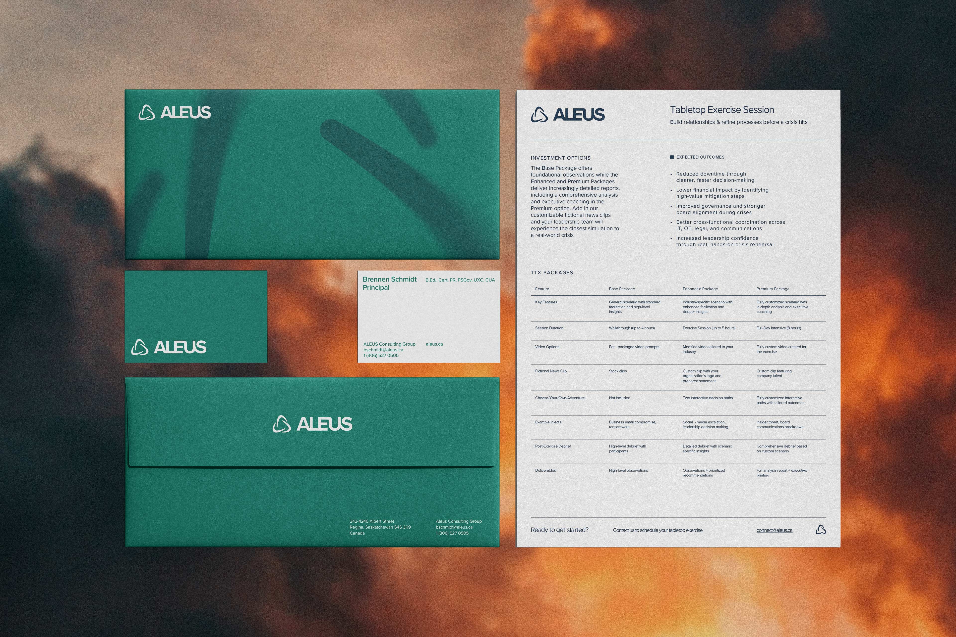
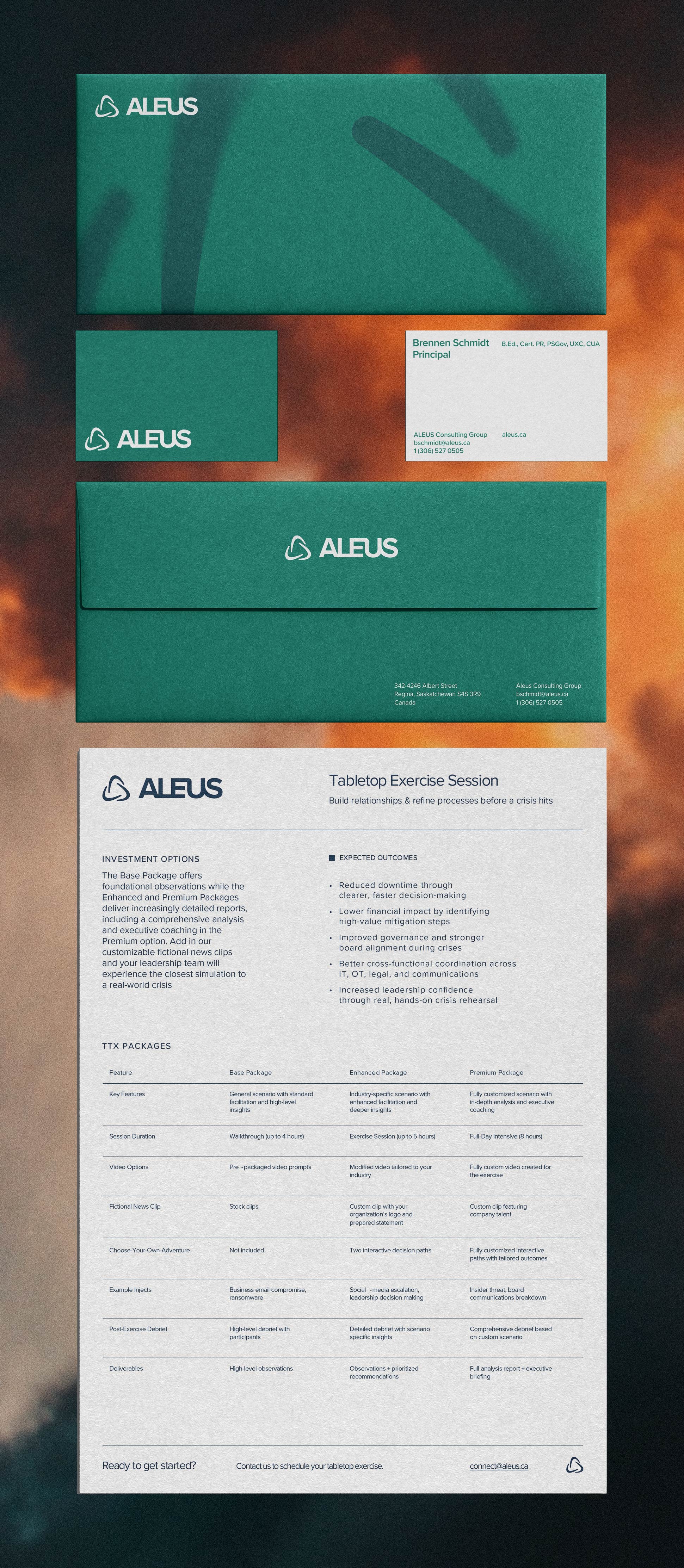
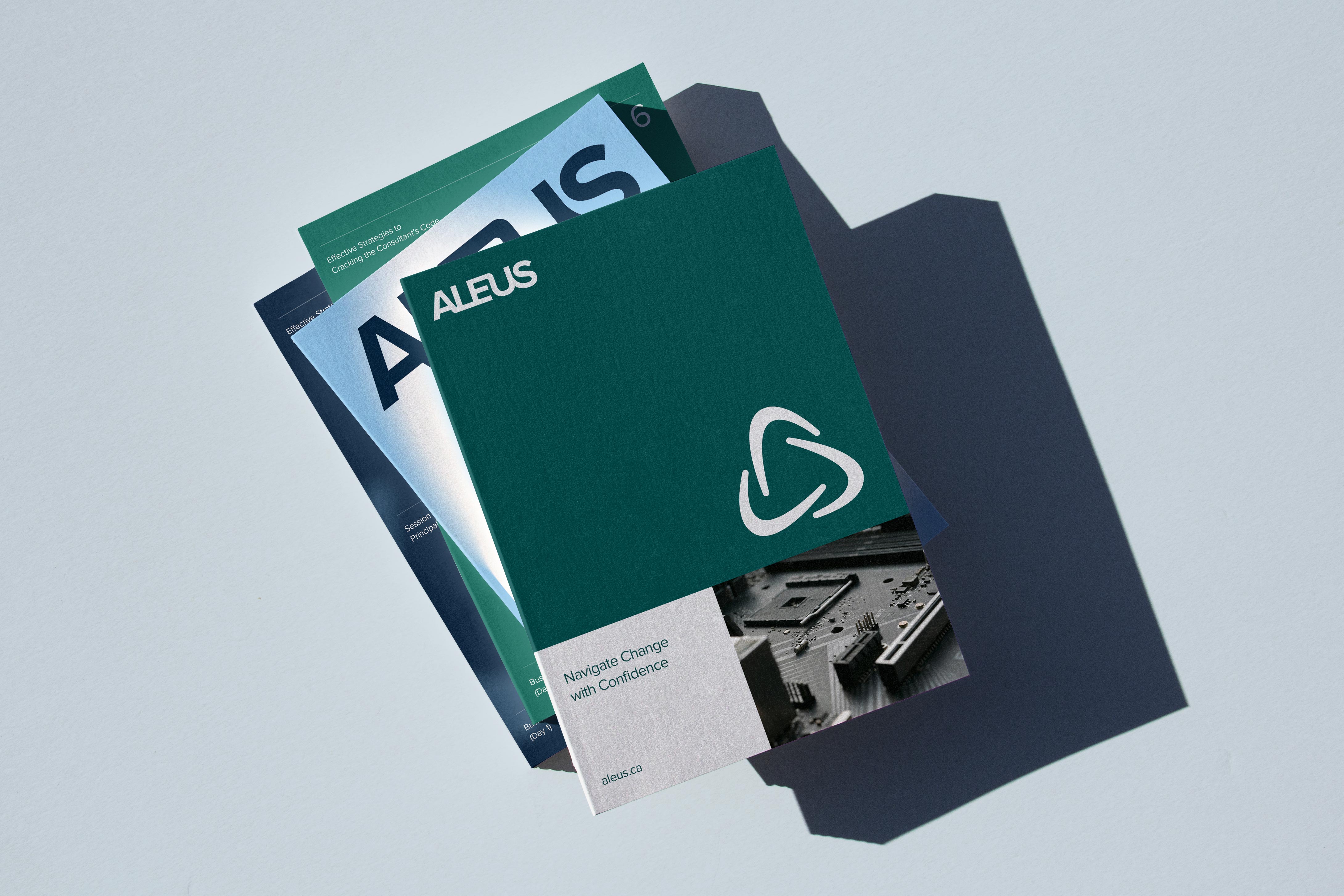
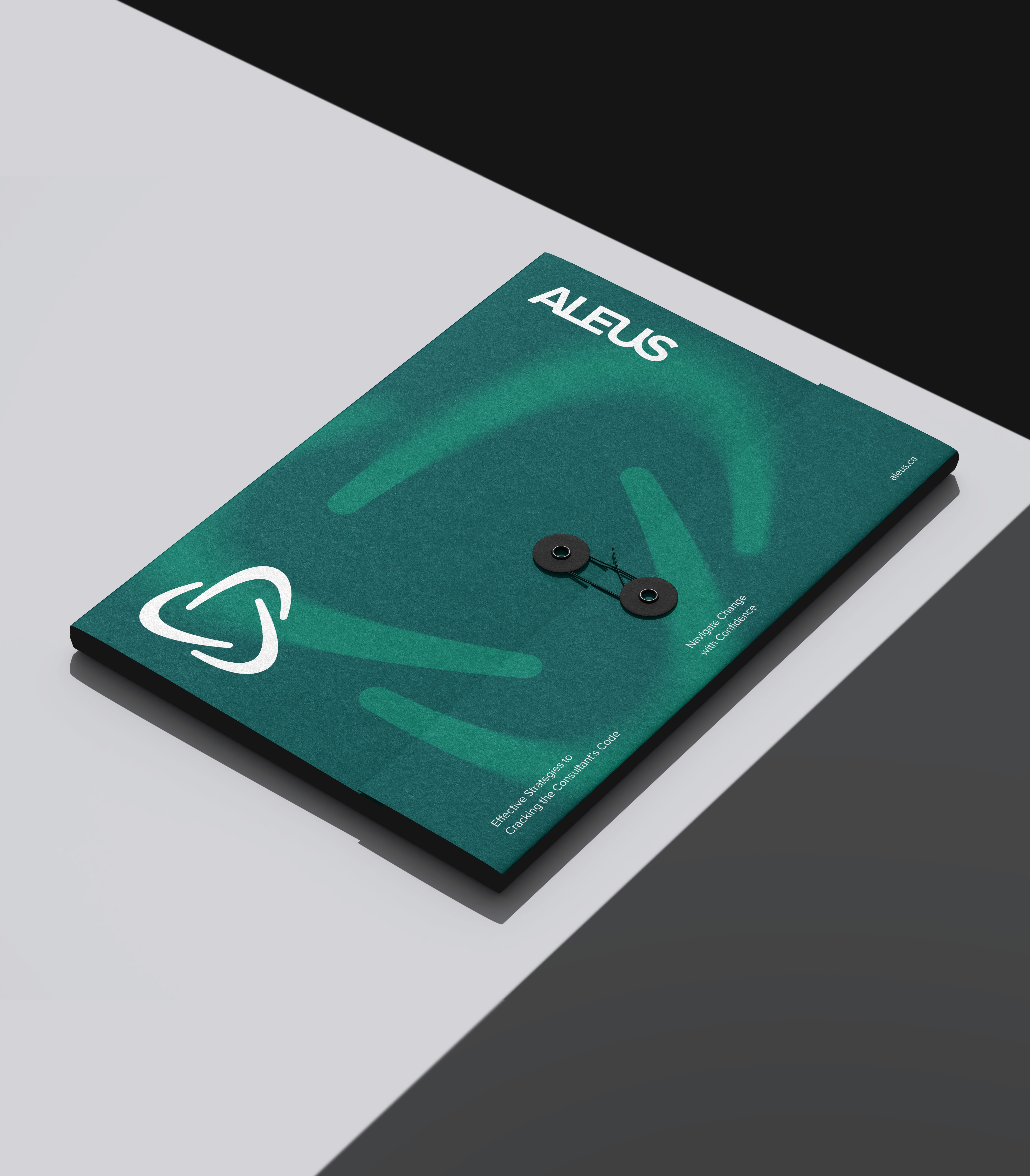
To support the flexibility of the Aleus brand, a system of logo variations was developed for use across different contexts and applications. This includes versions featuring the full business name, typographic-only treatments, and simplified marks without the symbol. Together, these variations ensure the identity remains clear, consistent, and adaptable across both digital and physical touchpoints.


The Aleus identity is built on a clear, practical design system that supports trust, clarity, and everyday usability. Proxima Nova was selected as the primary brand typeface for its modern proportions and high legibility, making it well suited for both digital platforms and long-form content. Garamond was introduced as a complementary serif to bring a more serious, established tone when needed, particularly in editorial moments or leadership-focused materials. To ensure the system could be carried confidently into client-facing work, Montserrat was recommended as a Microsoft-safe alternative that closely mirrors Proxima Nova for presentations and shared documents.
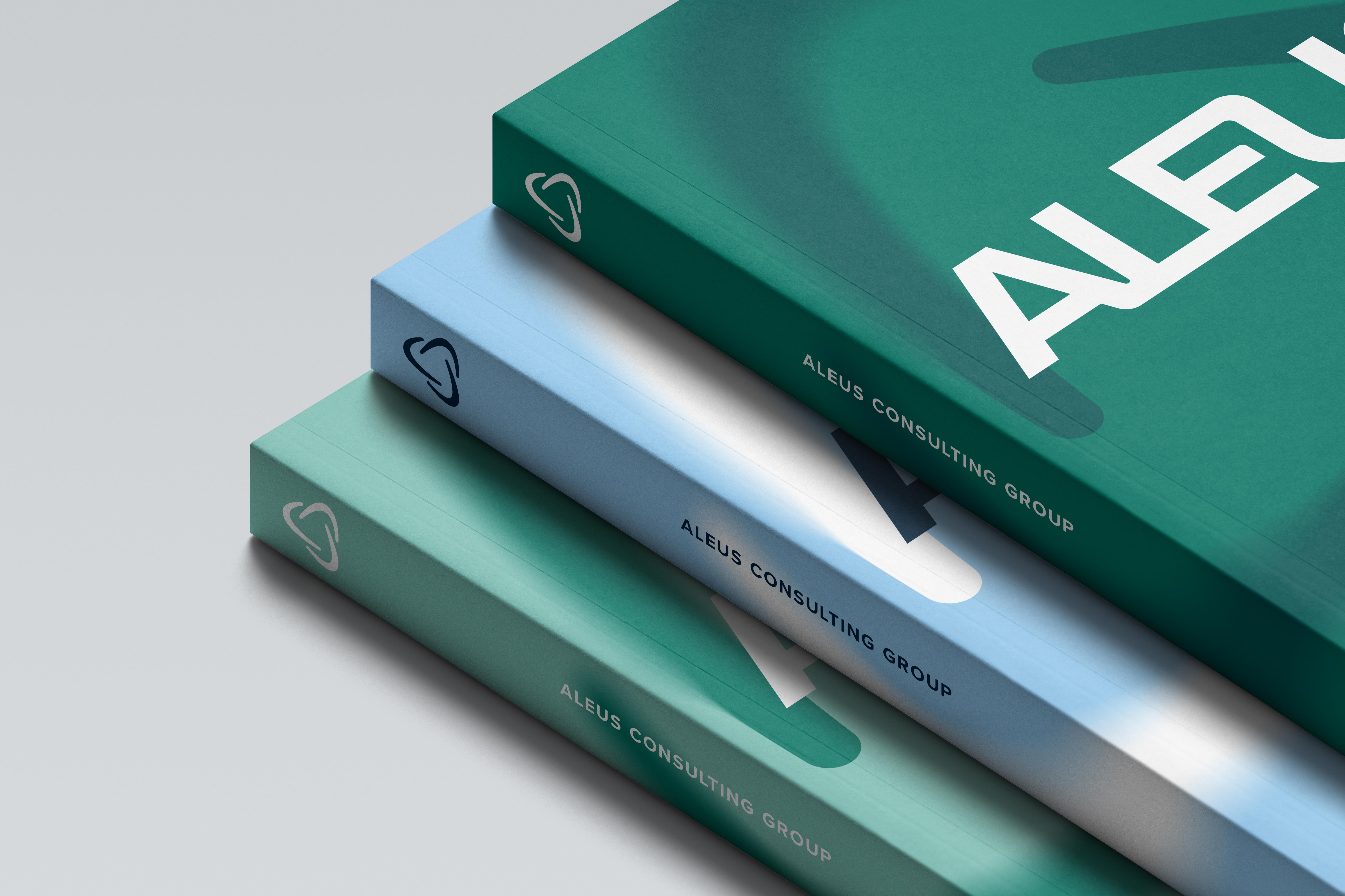
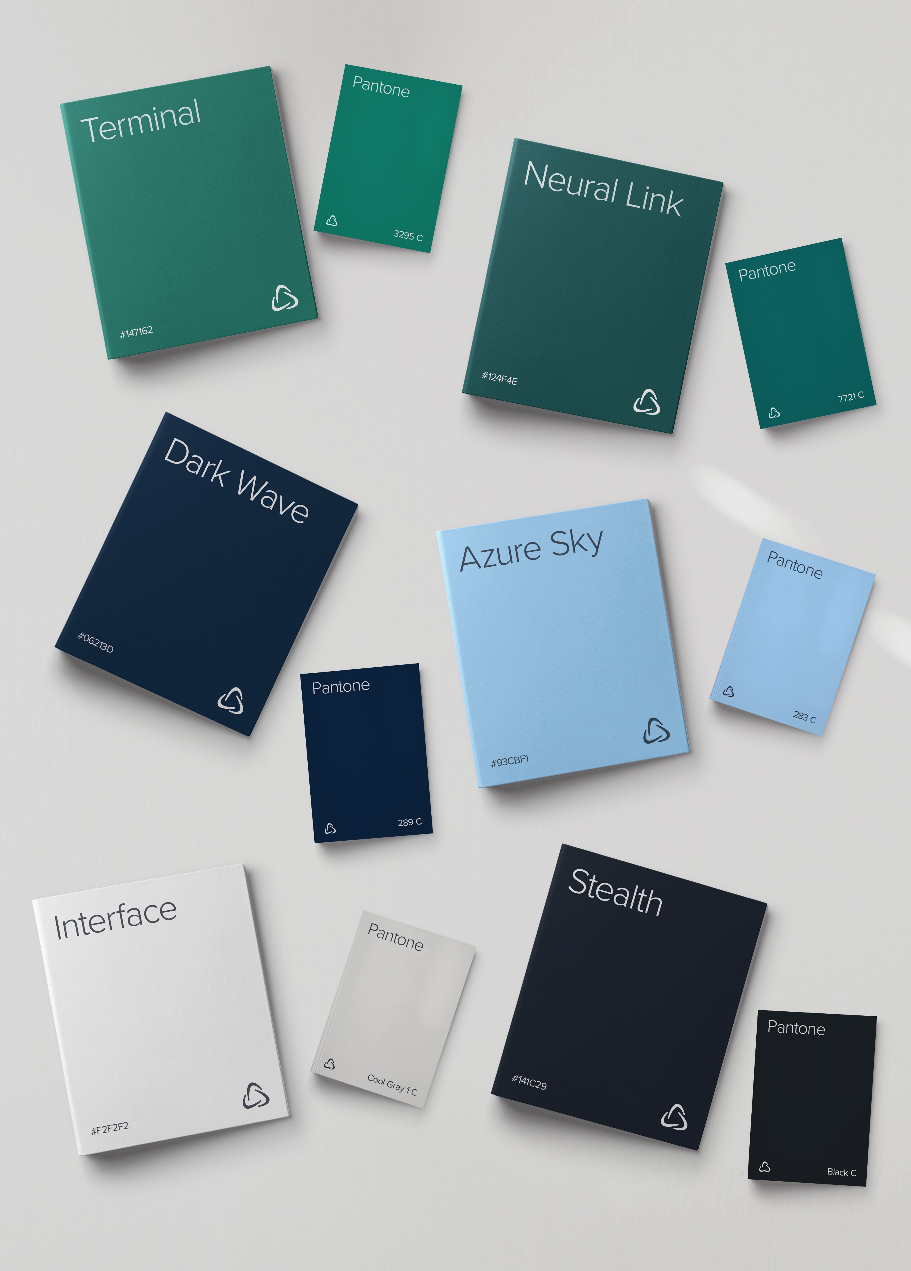
The colour palette reinforces the same balance of confidence and approachability. Terminal leads as the primary green-turquoise tone, establishing a calm and trustworthy foundation for the brand. Neural Link provides a deeper green contrast, while Dark Wave adds depth and structure as a supporting navy. Azure Sky introduces a lighter, optimistic accent, and the palette is completed by Interface, a soft off-white, and Stealth, a rich black, giving the system flexibility and consistency across print, digital, and presentation environments.


This work helped position Aleus as a trusted partner, pairing a refined visual identity with a sense of clarity and confidence that mirrors Brennen’s approach to consulting.