Homecourt was founded on the belief that sport has the power to transform spaces and bring people together. Built by the team behind Buckets & Borders, a national non-profit dedicated to restoring basketball courts, the company emerged from years of community-driven work and a growing demand for high-quality sport surfaces across the prairies. What began as volunteer court restorations quickly evolved into a vision for creating premium spaces where people could play, compete, and connect.
Specializing in backyard and commercial courts for basketball, tennis, pickleball, multi-sport, and playground environments, Homecourt designs, builds, and resurfaces spaces that are meant to be used, enjoyed, and proudly shared. Whether working with existing infrastructure or creating something entirely new, their focus is on craftsmanship, durability, and creating a finished space that feels personal and built to last.
When the founders approached me, Homecourt was a brand new venture with no existing identity. The creative direction was inspired by classic tennis clubs, vintage sport culture, and the feeling of belonging to something exclusive. Drawing influence from retro Miami colour palettes, old-school pennant flags, and iconic sports branding, the goal was to create an identity that felt established, nostalgic, and full of character, while still being clean, modern, and credible.


Inspired by classic athletic memorabilia and vintage sport culture.
Inspired by classic athletic memorabilia and vintage sport culture.
Like all of my identity projects, the Homecourt logo began on paper. I explored a wide range of directions, including sports ball symbols, monograms, crests, and “HC” initial lockups, searching for a mark that felt rooted in classic sport culture while still being timeless and versatile. Three core directions were developed through this process, with one idea quickly emerging as the foundation for the final identity, a direction that can be seen taking shape in the early sketches.
Like all of my identity projects, the Homecourt logo began on paper. I explored a wide range of directions, including sports ball symbols, monograms, crests, and “HC” initial lockups, searching for a mark that felt rooted in classic sport culture while still being timeless and versatile. Three core directions were developed through this process, with one idea quickly emerging as the foundation for the final identity, a direction that can be seen taking shape in the early sketches.
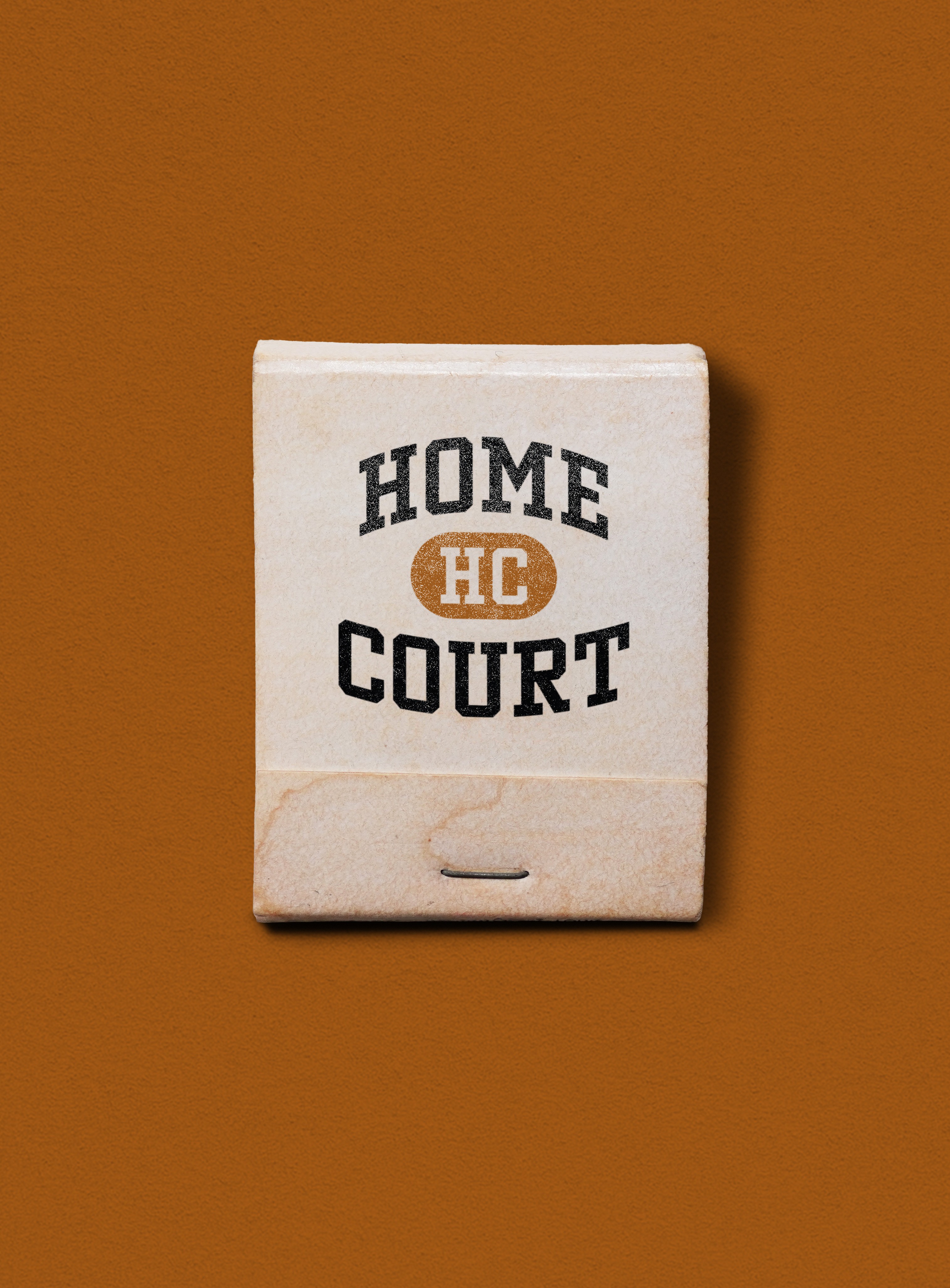
Inspired by vintage athletic typography and classic team graphics, the Homecourt wordmark takes cues from old-school sports sweaters, pennants, and club crests. The arched “Home” adds energy and movement, while the rounded container below creates weight and structure. Together, they give the mark a proud, nostalgic feel that reflects Homecourt’s focus on community, belonging, and timeless sport culture.
Inspired by vintage athletic typography and classic team graphics, the Homecourt wordmark takes cues from old-school sports sweaters, pennants, and club crests. The arched “Home” adds energy and movement, while the rounded container below creates weight and structure. Together, they give the mark a proud, nostalgic feel that reflects Homecourt’s focus on community, belonging, and timeless sport culture.


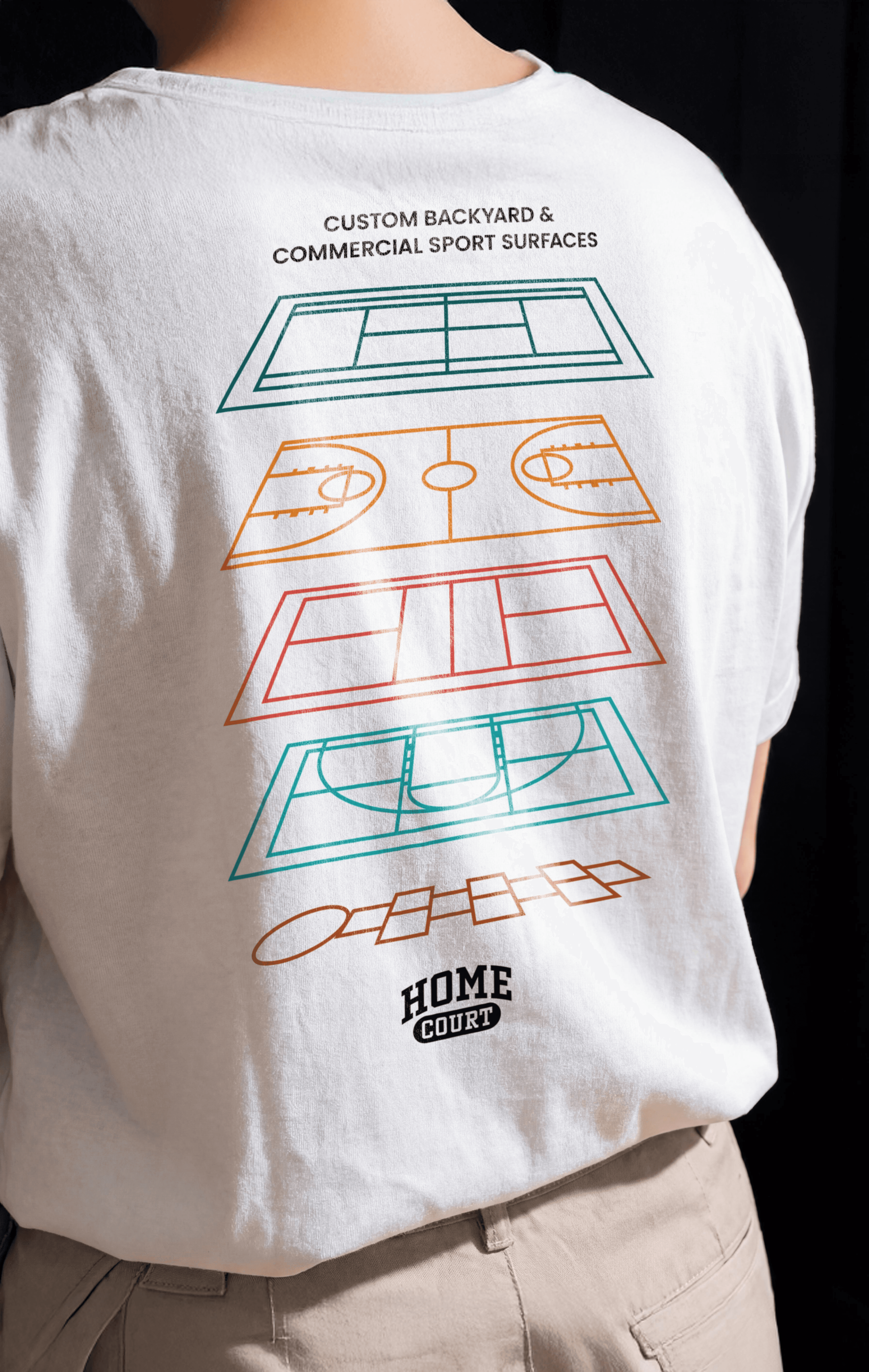
To expand the identity, we built a flexible system of supporting marks, icons, and graphics designed to reflect the range of sports and surfaces Homecourt offers. Custom ball icons and court layouts were developed in both solid and stroke styles, allowing the brand to adapt seamlessly across signage, apparel, digital, and environmental applications. The logo system was also designed with versatility in mind, with full-colour, solid, and knock-out versions ensuring strong legibility on any surface or background. Together, these elements create a cohesive visual language that feels playful, considered, and unmistakably Homecourt.
To expand the identity, we built a flexible system of supporting marks, icons, and graphics designed to reflect the range of sports and surfaces Homecourt offers. Custom ball icons and court layouts were developed in both solid and stroke styles, allowing the brand to adapt seamlessly across signage, apparel, digital, and environmental applications. The logo system was also designed with versatility in mind, with full-colour, solid, and knock-out versions ensuring strong legibility on any surface or background. Together, these elements create a cohesive visual language that feels playful, considered, and unmistakably Homecourt.


The Homecourt identity is anchored by a bold, sport-driven type system that balances heritage with approachability. Winner Narrow leads the brand with a strong serif presence inspired by vintage varsity lettering and classic athletic graphics. Its condensed, uppercase forms give the wordmark structure and confidence, while Poppins provides a clean, geometric counterbalance for clarity and readability across signage, apparel, and digital applications.
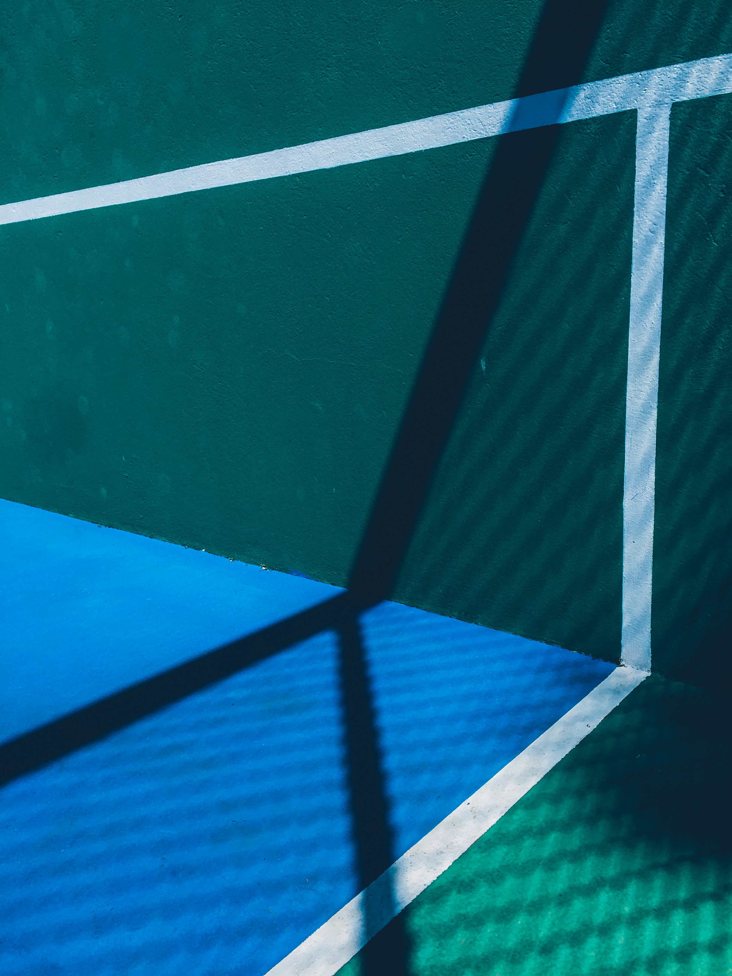
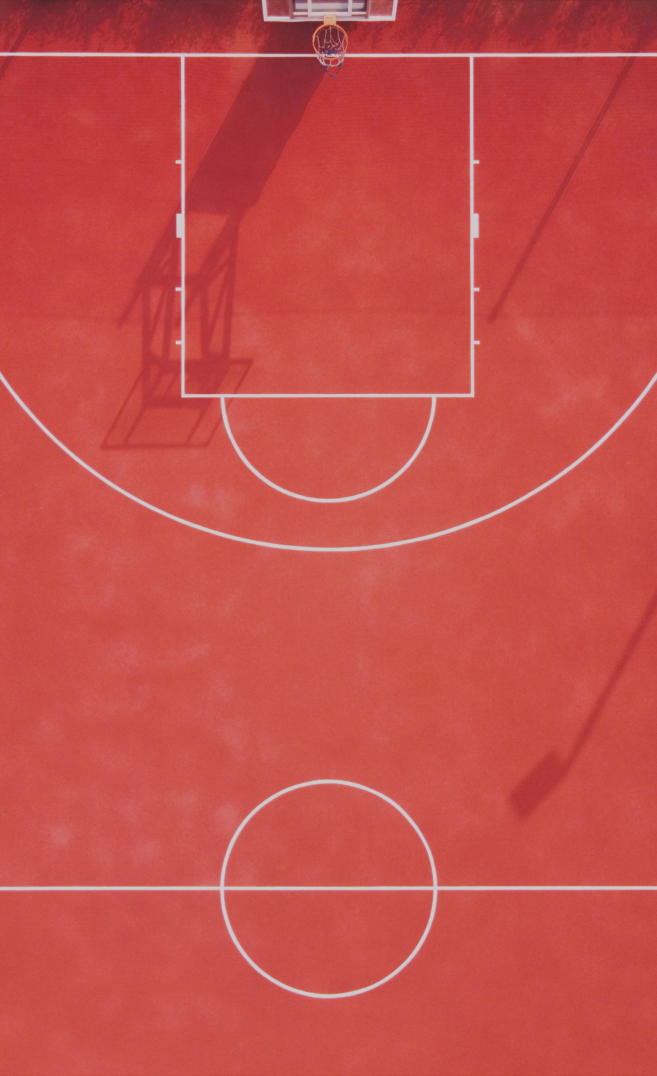
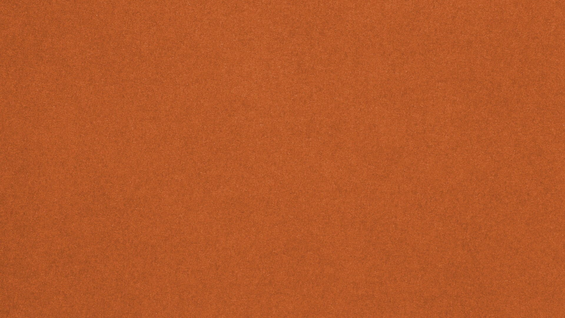
The colour palette was designed to feel bright, playful, and instantly recognizable, rooted in the environments Homecourt works within. Shoreline Pine serves as the primary tone, a deep teal inspired by traditional court surfaces for tennis, pickleball, and wall ball. It’s supported by Sunset Slam, a high-contrast orange that brings energy and visibility, Flamingo, a warm coral nodding to Florida and sun-soaked club culture, and Tropical Teal, a lighter, ocean-inspired hue that leans into Miami and beachside sport influences. Klay Thompson, a rusty clay orange, references clay tennis courts while adding a subtle basketball tie-in through its naming. Outline, an off-white, and Asphalt, a rich black, ground the system and echo the fundamental materials of the game: painted lines and asphalt surfaces. Together, the palette captures the spirit of summer sport while giving the brand flexibility, depth, and personality.
The Homecourt identity is anchored by a bold, sport-driven type system that balances heritage with approachability. Winner Narrow leads the brand with a strong serif presence inspired by vintage varsity lettering and classic athletic graphics. Its condensed, uppercase forms give the wordmark structure and confidence, while Poppins provides a clean, geometric counterbalance for clarity and readability across signage, apparel, and digital applications.
The colour palette was designed to feel bright, playful, and instantly recognizable, rooted in the environments Homecourt works within. Shoreline Pine serves as the primary tone, a deep teal inspired by traditional court surfaces for tennis, pickleball, and wall ball. It’s supported by Sunset Slam, a high-contrast orange that brings energy and visibility, Flamingo, a warm coral nodding to Florida and sun-soaked club culture, and Tropical Teal, a lighter, ocean-inspired hue that leans into Miami and beachside sport influences. Klay Thompson, a rusty clay orange, references clay tennis courts while adding a subtle basketball tie-in through its naming. Outline, an off-white, and Asphalt, a rich black, ground the system and echo the fundamental materials of the game: painted lines and asphalt surfaces. Together, the palette captures the spirit of summer sport while giving the brand flexibility, depth, and personality.


PROFESSIONAL SPORTS SURFACE CONTRACTOR
PROFESSIONAL SPORTS SURFACE CONTRACTOR
Sports &
Sports &
Surfaces
Surfaces
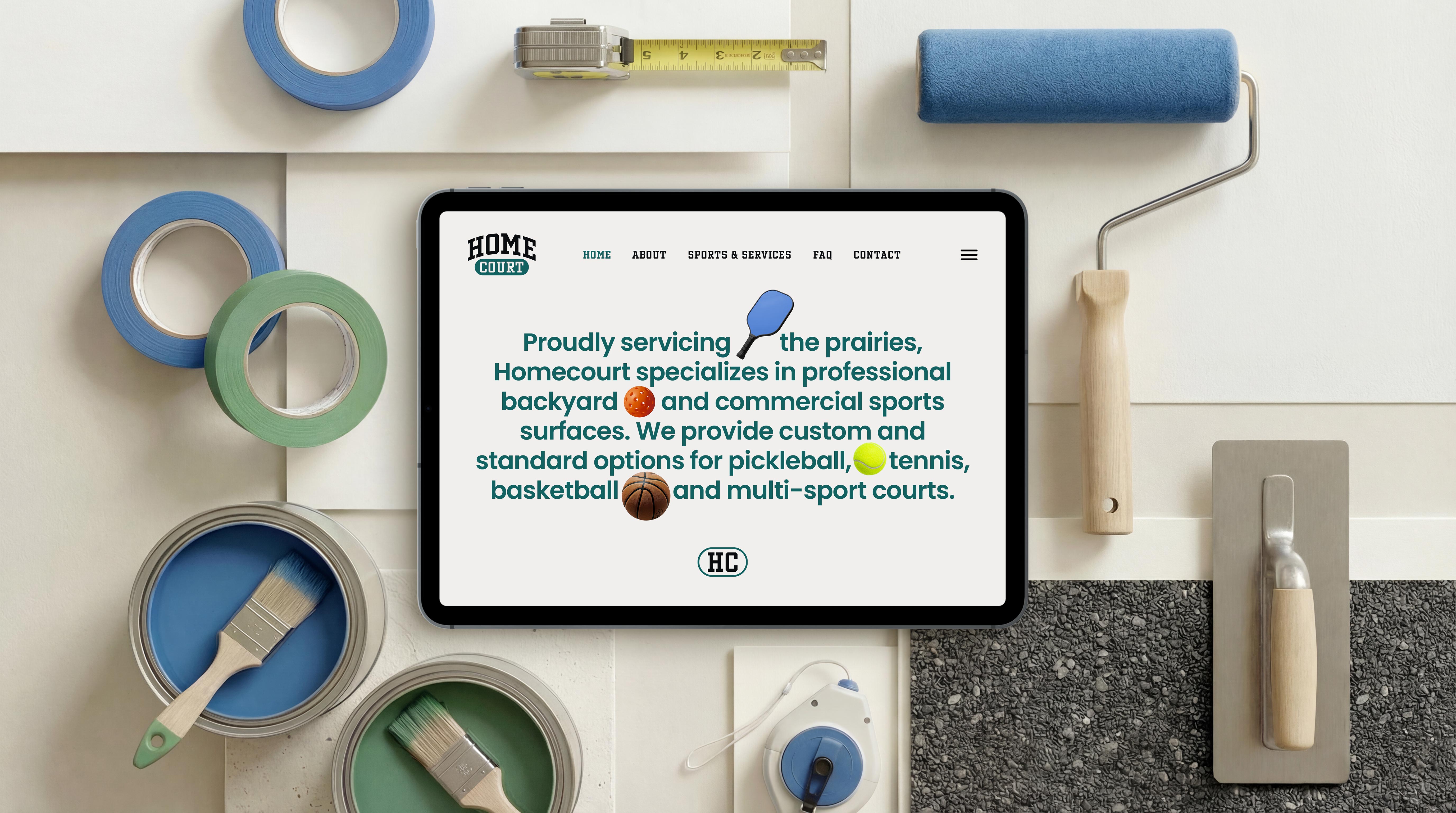
Homecourt specializes in backyard and commercial sport surfaces. We provide custom and standard options for pickleball, tennis, basketball and multi-sport courts. We repair, build, and work with existing infrastructure. Whether it is your backyard or community park, we work with you to build your Homecourt advantage. Our brand is inspired by the classic tennis club and the ability that sport has to bring us together.
Homecourt specializes in backyard and commercial sport surfaces. We provide custom and standard options for pickleball, tennis, basketball and multi-sport courts. We repair, build, and work with existing infrastructure. Whether it is your backyard or community park, we work with you to build your Homecourt advantage. Our brand is inspired by the classic tennis club and the ability that sport has to bring us together.
PRIMARY TYPEFACE – Brand
WINNER NARROW
WINNER NARROW
SECONDARY TYPEFACE
POPPINS
POPPINS
Support & Body Copy
Poppins
Poppins
PROFESSIONAL SPORTS SURFACE CONTRACTOR
Sports &
Surfaces
Homecourt specializes in backyard and commercial sport surfaces. We provide custom and standard options for pickleball, tennis, basketball and multi-sport courts. We repair, build, and work with existing infrastructure. Whether it is your backyard or community park, we work with you to build your Homecourt advantage. Our brand is inspired by the classic tennis club and the ability that sport has to bring us together.
PRIMARY TYPEFACE – Brand
WINNER NARROW
SECONDARY TYPEFACE
POPPINS
Support & Body Copy
Poppins

Why Winner Narrow
Winner Narrow was selected for its classic athletic character and strong varsity influence. Its condensed, slab serif forms bring structure, confidence, and a timeless sport-first attitude to the Homecourt identity.
Winner Narrow was selected for its classic athletic character and strong varsity influence. Its condensed, slab serif forms bring structure, confidence, and a timeless sport-first attitude to the Homecourt identity.
Why Winner Narrow
Winner Narrow was selected for its classic athletic character and strong varsity influence. Its condensed, slab serif forms bring structure, confidence, and a timeless sport-first attitude to the Homecourt identity.
Why Winner Narrow
Winner Narrow was selected for its classic athletic character and strong varsity influence. Its condensed, slab serif forms bring structure, confidence, and a timeless sport-first attitude to the Homecourt identity.


This project was a chance to honour sport culture while shaping something fresh and modern. A brand built for belonging, pride, and the joy of the game.
This project was a chance to honour sport culture while shaping something fresh and modern. A brand built for belonging, pride, and the joy of the game.