Grasslands at Harbour Landing is one of Regina’s premier retail and dining destinations, developed and operated by Harvard Developments. In 2025, Matt Gieger approached me to help reimagine the Grasslands brand alongside its sister property, Currents of Windermere in Edmonton. Both centres were well established, but their identities no longer reflected the growth, energy, and long-term vision behind them.
The challenge was not to start over, but to evolve. Existing pylon signage remained in place across the properties, meaning the new identity needed to feel fresh and future-focused without creating disconnect for retailers or the public. Previous rebranding exercises had not fully captured that balance. What was needed was a system that felt new, cohesive, and enduring while still honouring the equity already built into the name.
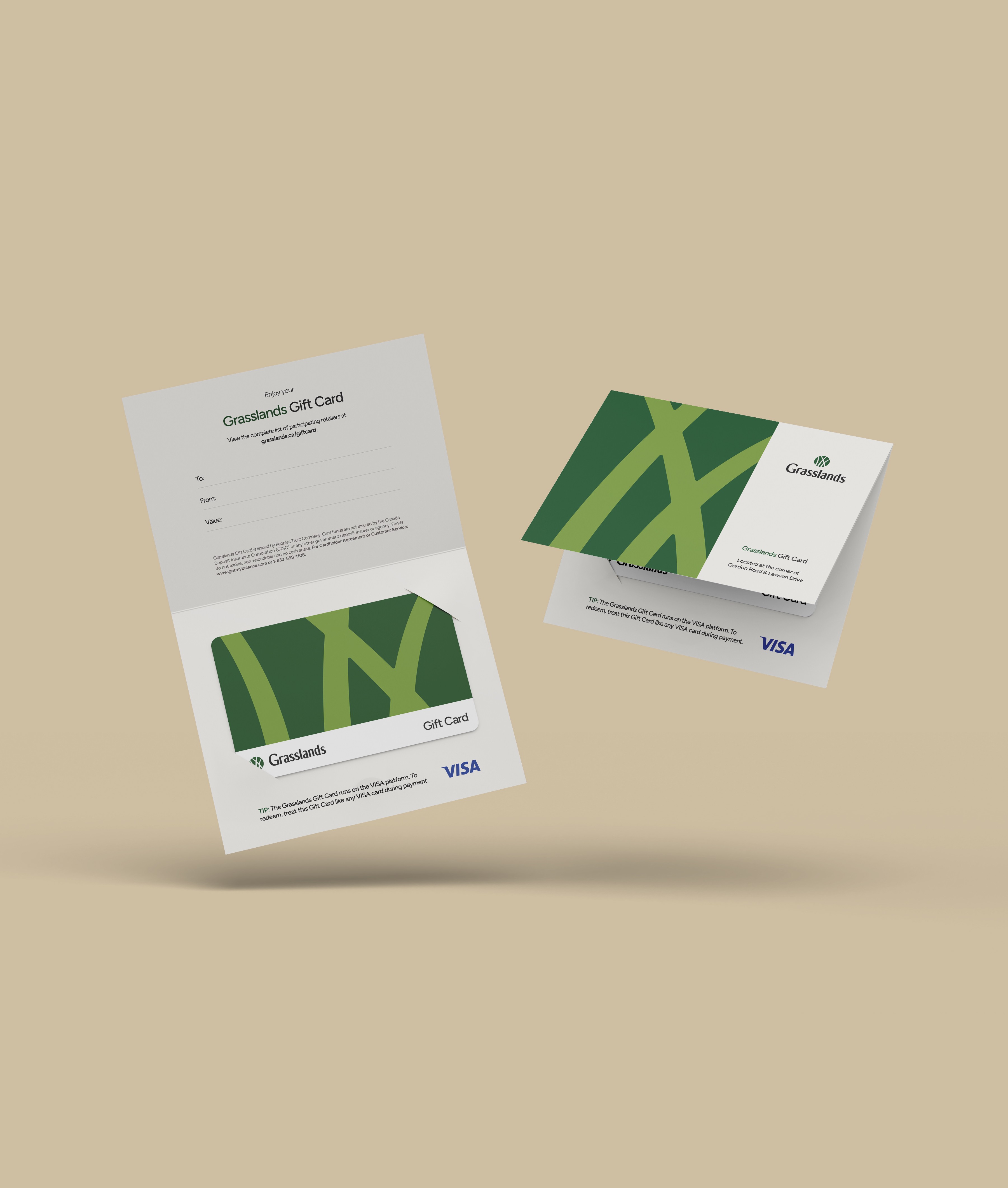
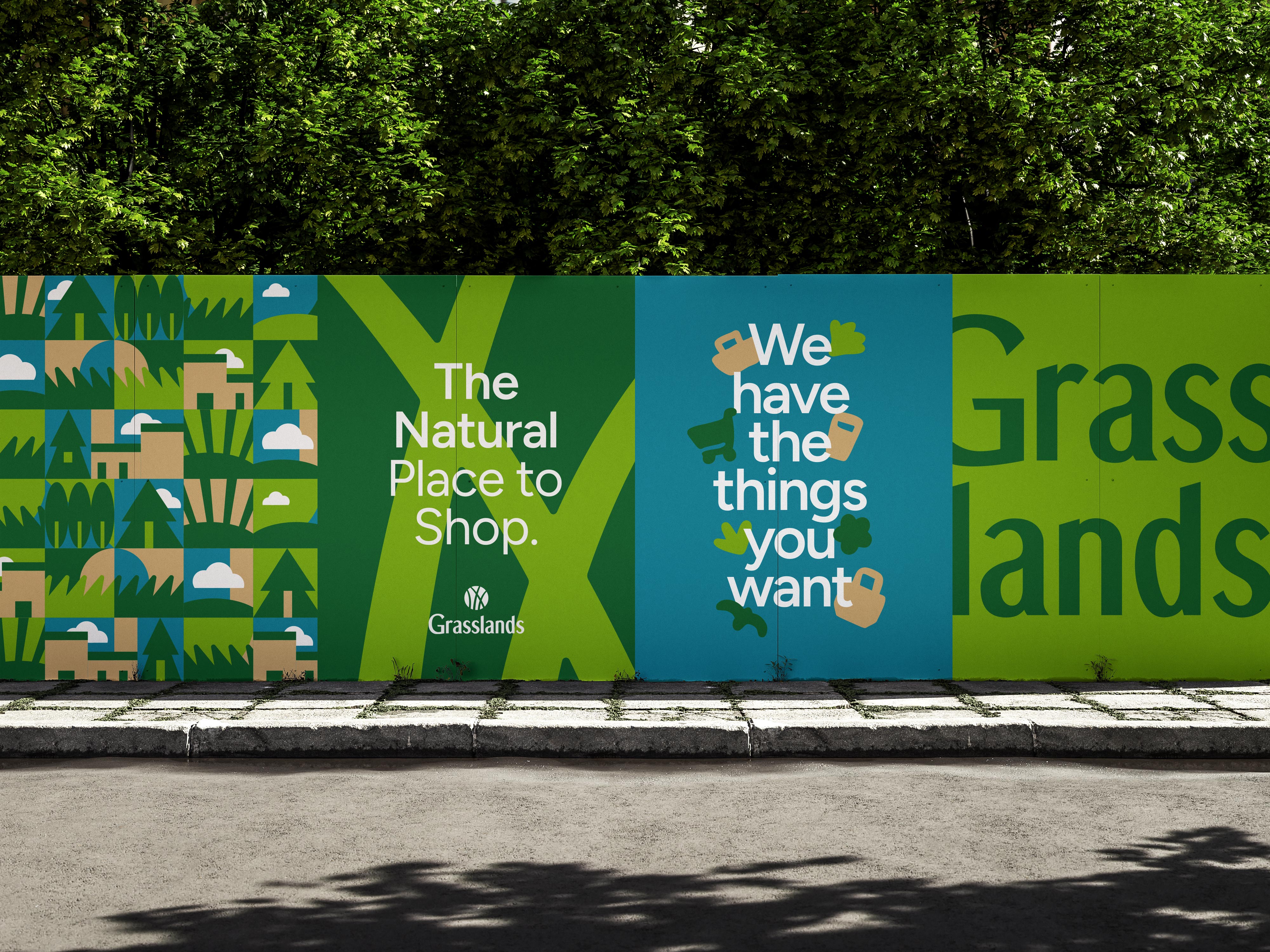
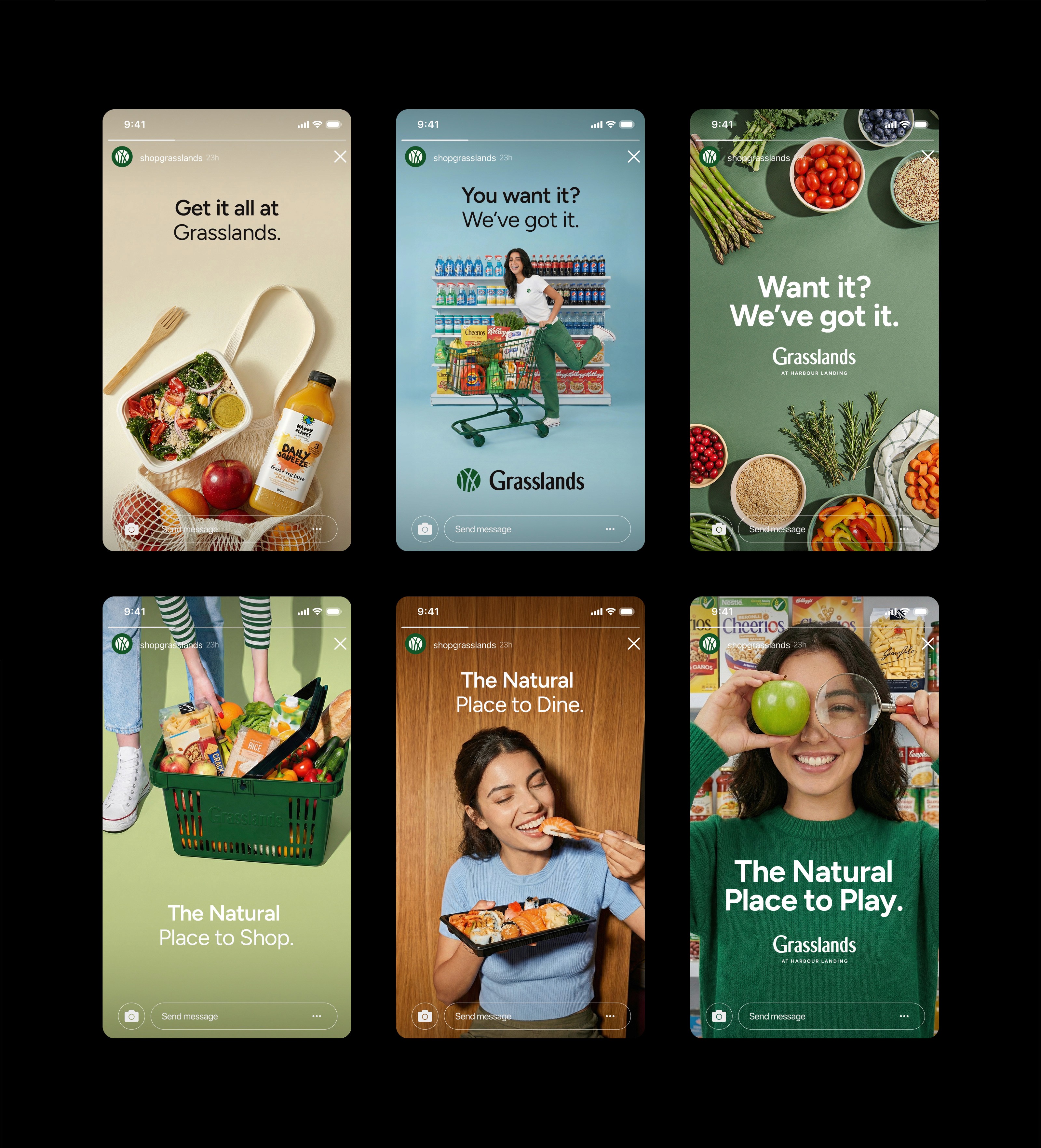
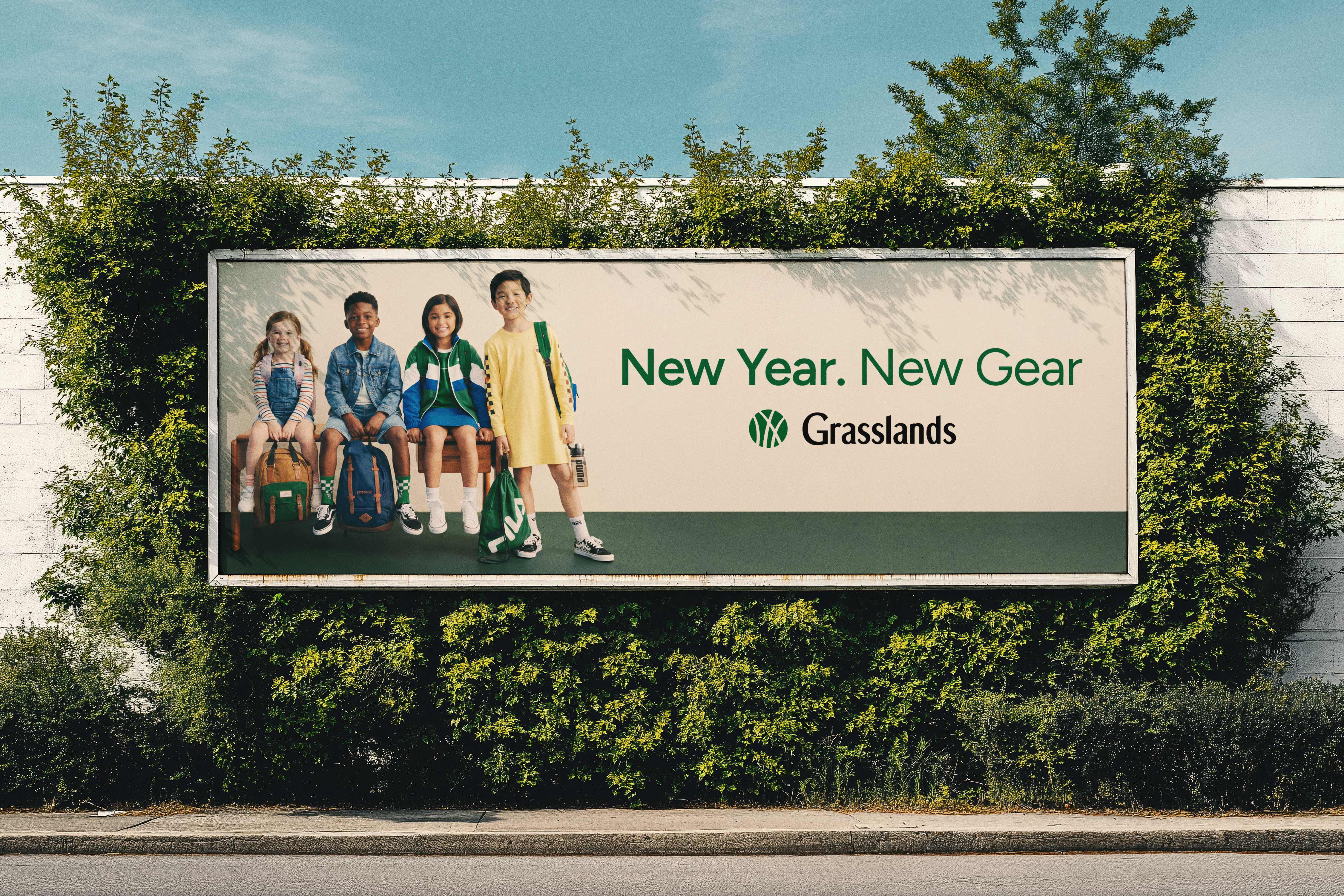
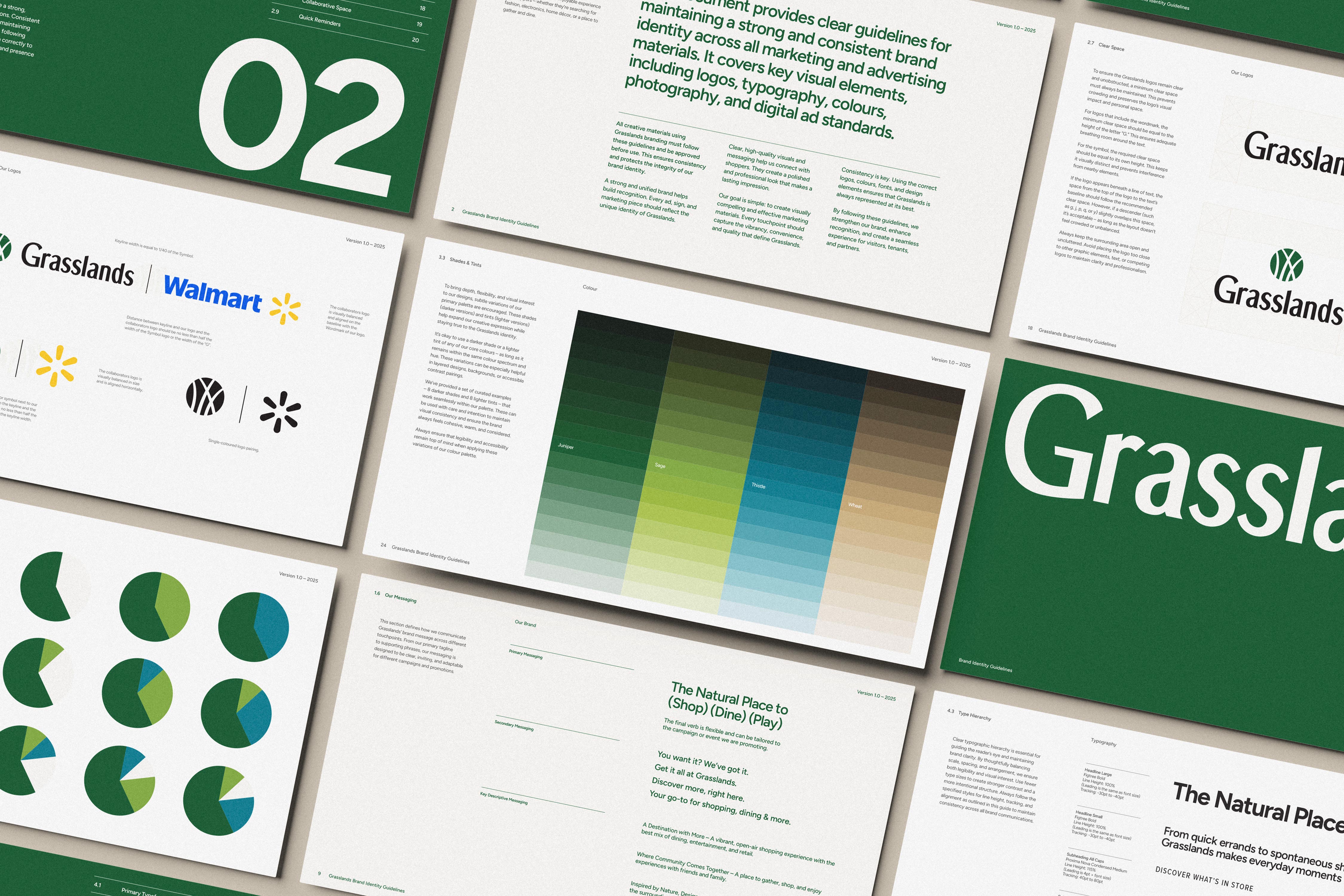
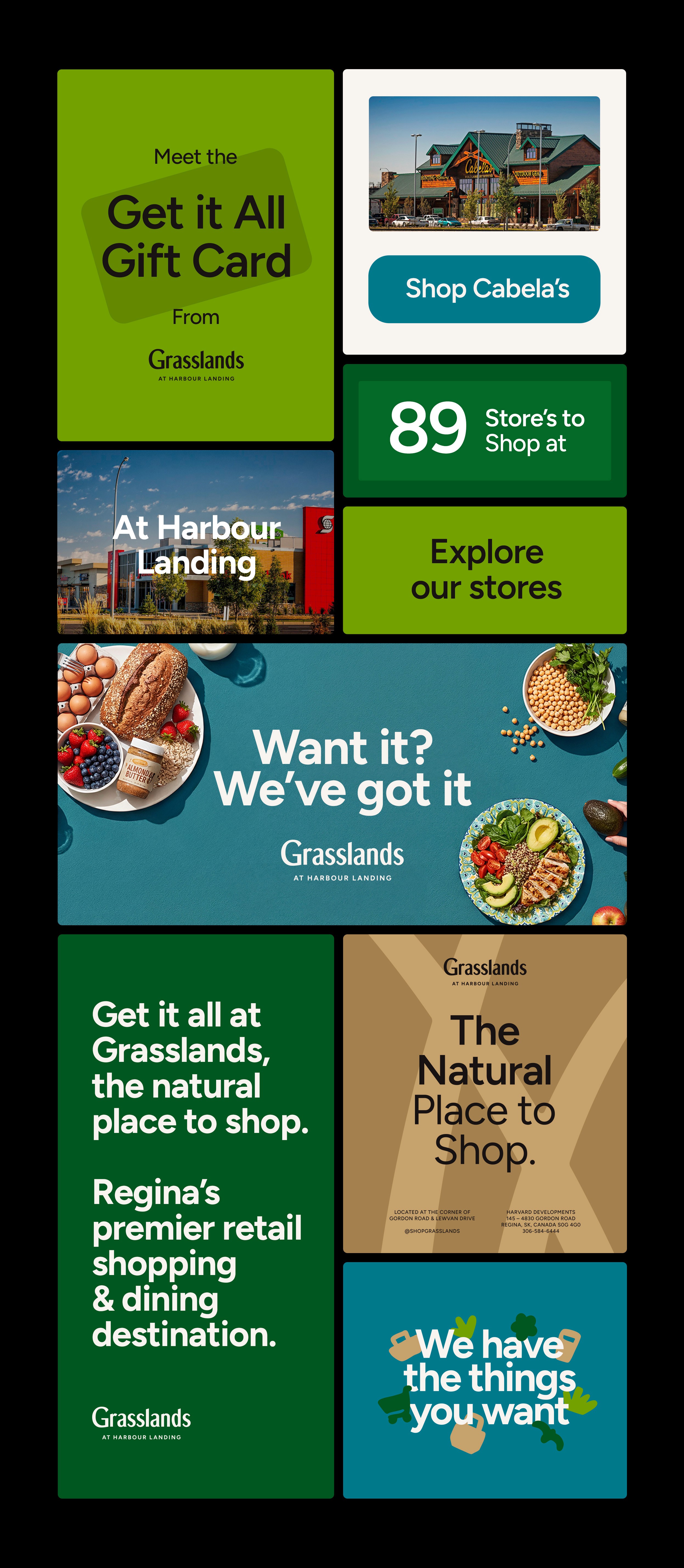
For Grasslands, the result was a refined and modern identity rooted in clarity and longevity. The brand system extends far beyond a logo, introducing a flexible visual toolkit designed to support marketing, leasing, signage, and digital touchpoints. While Currents of Windermere followed a similar strategic direction, each property was given its own distinct symbol, typography, and colour palette, ensuring both consistency and individuality across the portfolio.


From our first meeting, it was clear the wordmark itself didn’t need to be reinvented. It had equity and recognition within the community, even if some letterforms and spacing needed refinement. Rather than forcing change where it wasn’t necessary, I focused on developing a symbol the brand could truly stand behind.
Throughout the property’s history, blades of grass had consistently appeared as a visual motif, seen on site signage, waste bins, and landscaping details. That continuity felt important. I began sketching a wide range of grass-inspired marks, exploring forms that felt warm, iconic, and scalable. The goal was to create something simple yet distinctive, a symbol that could anchor the identity and carry the brand forward with clarity and longevity.

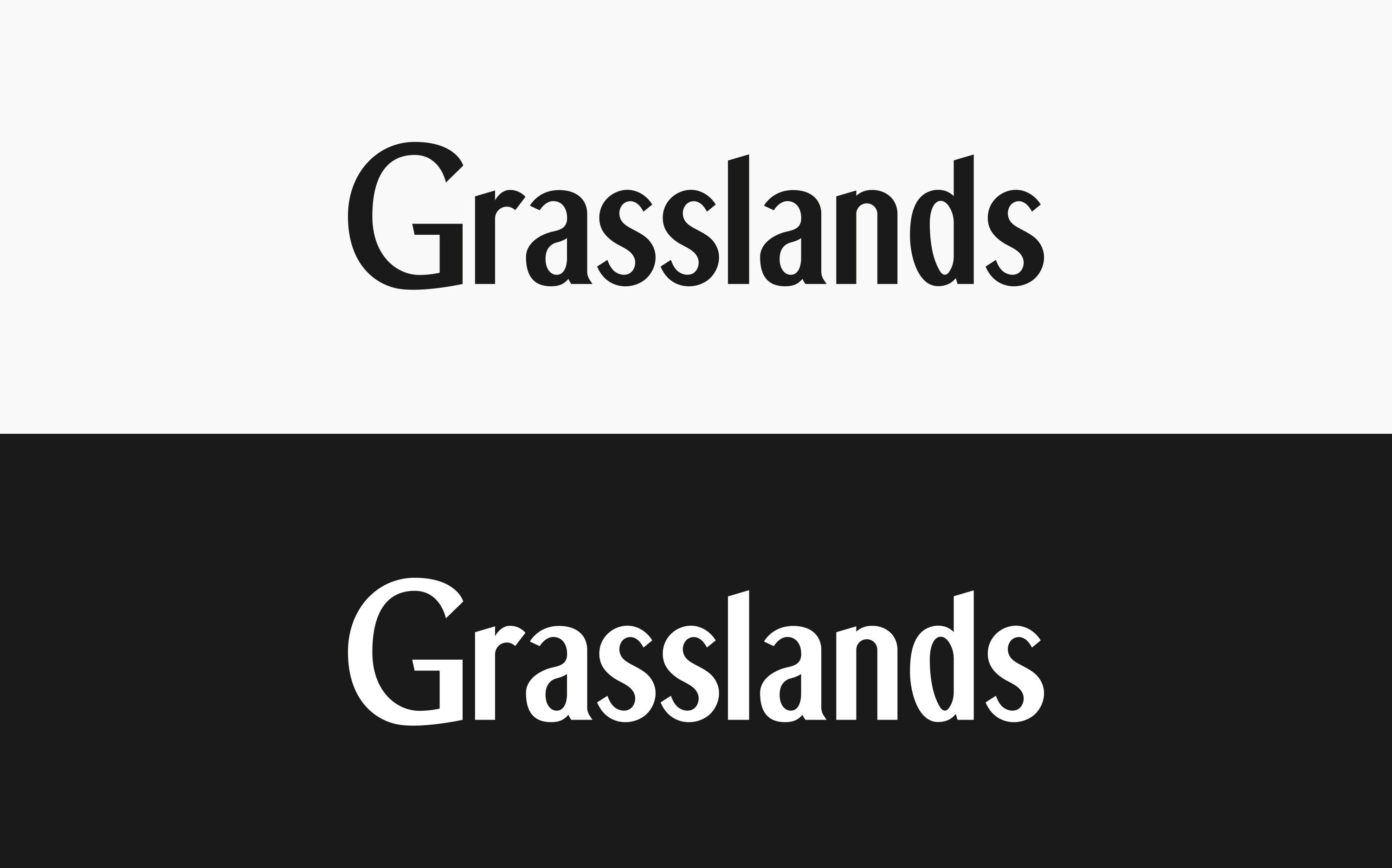
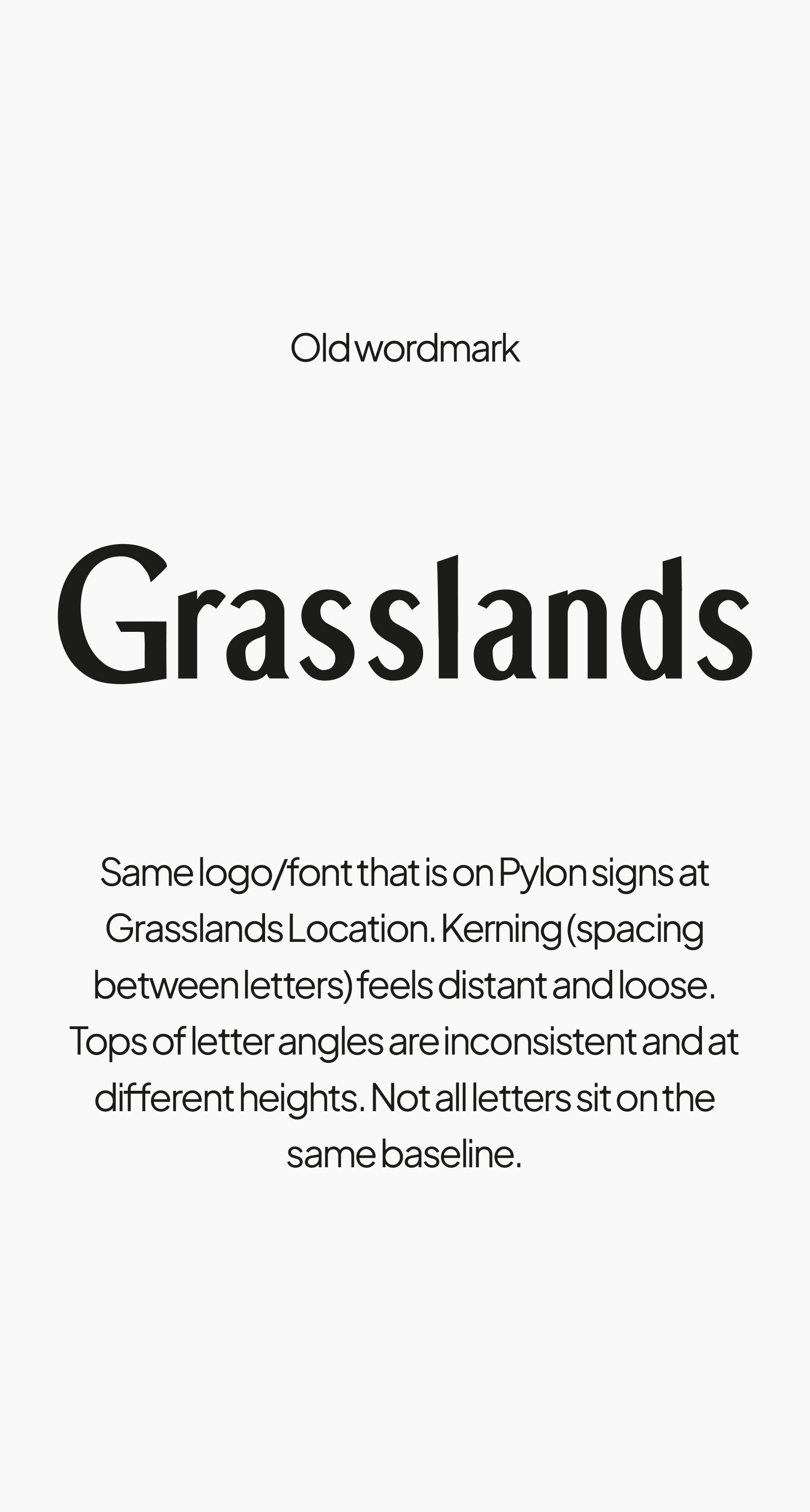
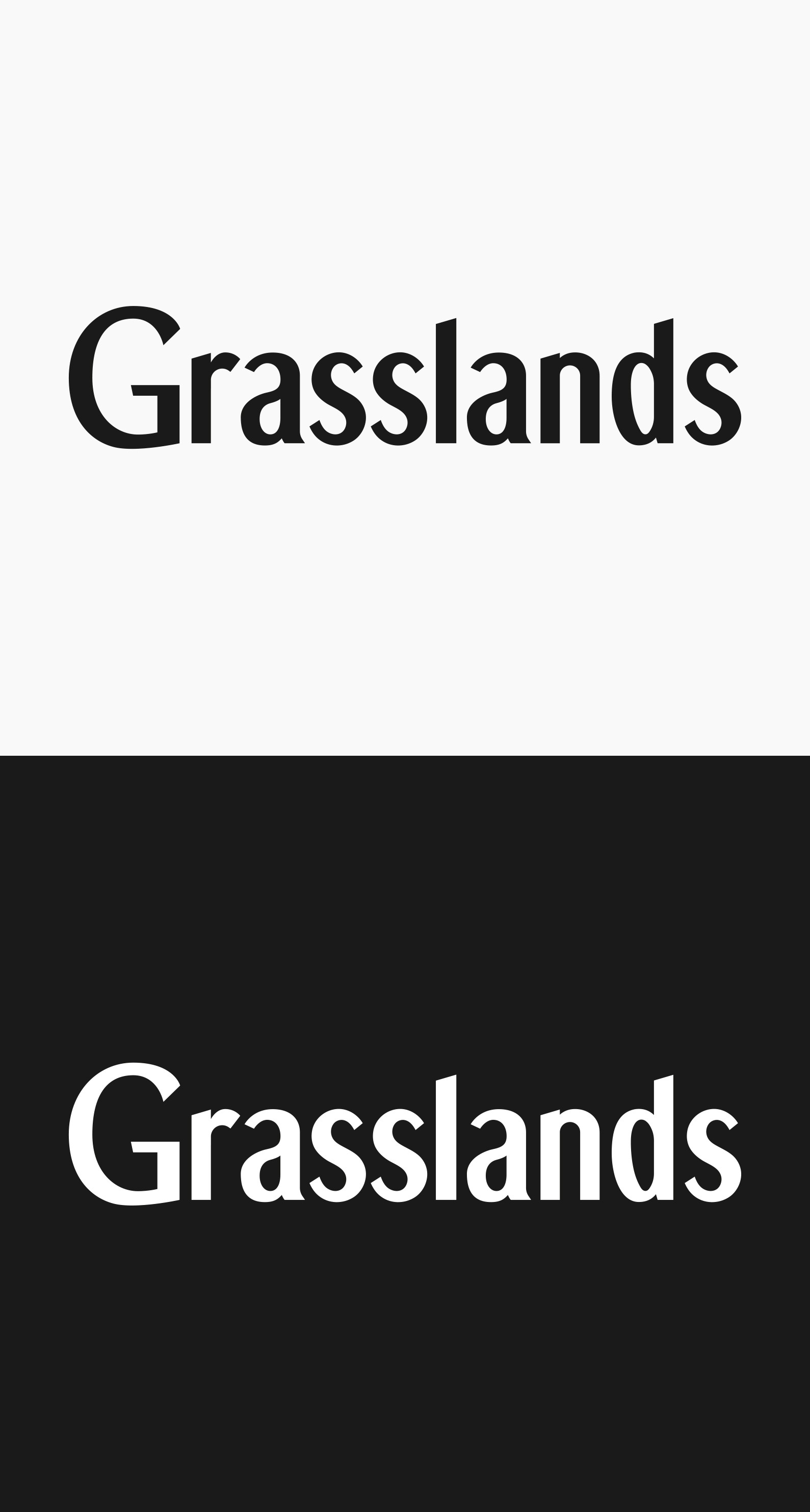
The existing Grasslands wordmark carried strong recognition across Harbour Landing, so the goal was never to reinvent it, but to refine it. When reviewed up close, the original mark (designer unknown) showed a handful of inconsistencies: uneven baselines, irregular angles and curves, small construction quirks, and loose kerning that made the lettering feel slightly unbalanced. I rebuilt the wordmark with a lighter touch, correcting spacing, alignment, and letterform details while preserving the familiar silhouette. The result is the same word everyone knows, now simply more polished, consistent, and built to hold up across every application.


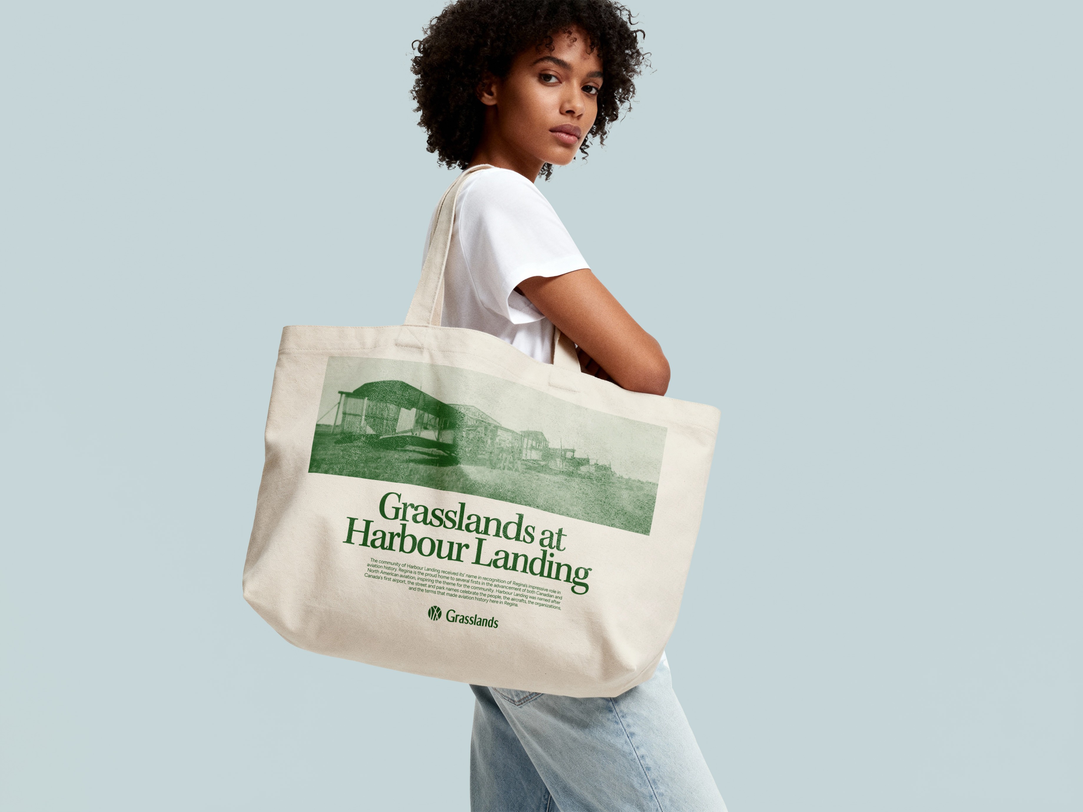


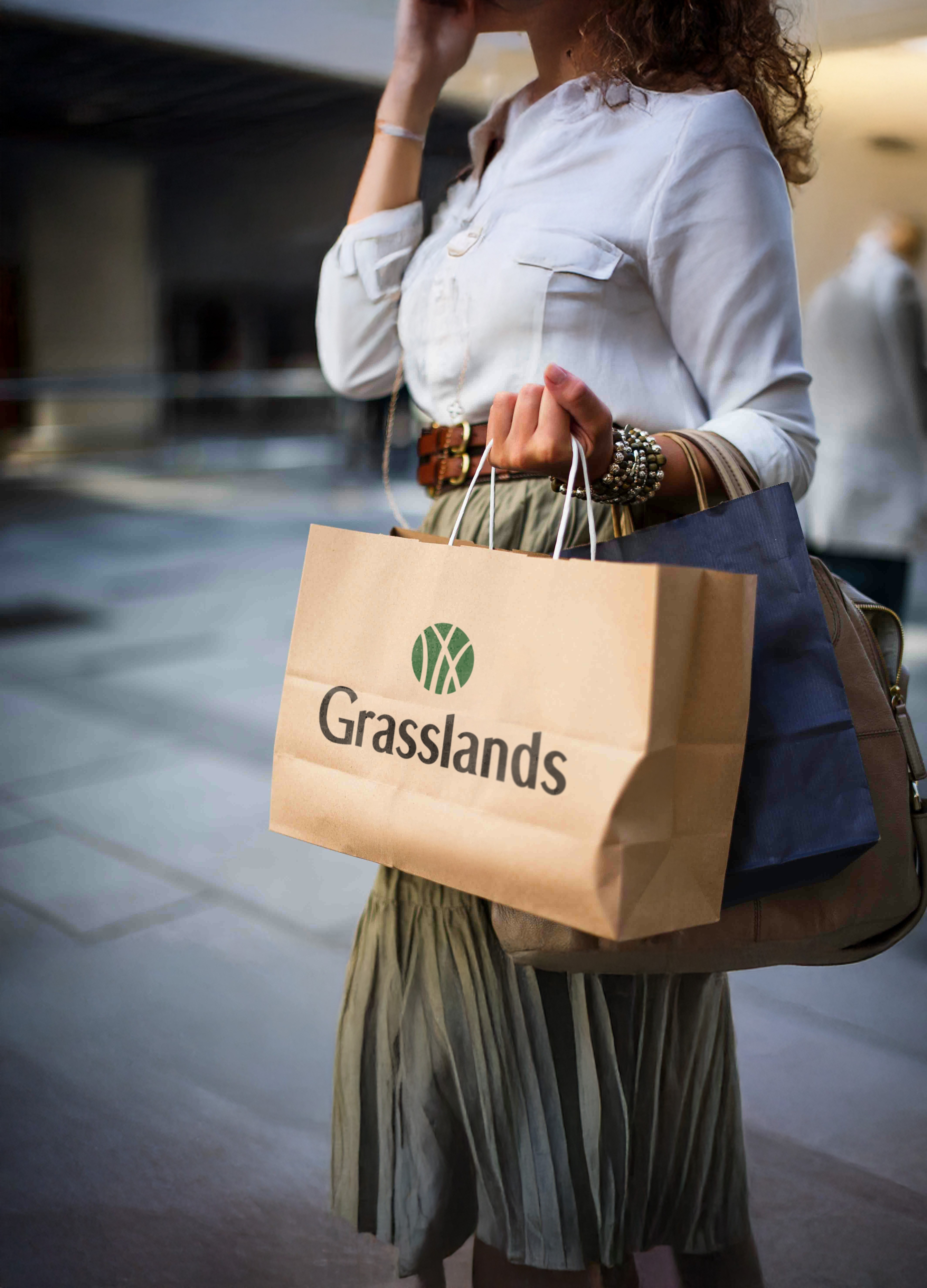


The Grasslands identity is built around clarity, familiarity, and a sense of place. Typography is led by Figtree, a clean and contemporary sans serif chosen for its warmth and versatility. Its open forms complement the refined wordmark and circular grass symbol while remaining highly legible across large-scale signage, print, and digital applications. Proxima Nova Condensed is used sparingly as a secondary typeface, introducing subtle contrast and structure while maintaining a cohesive, modern tone throughout the system.
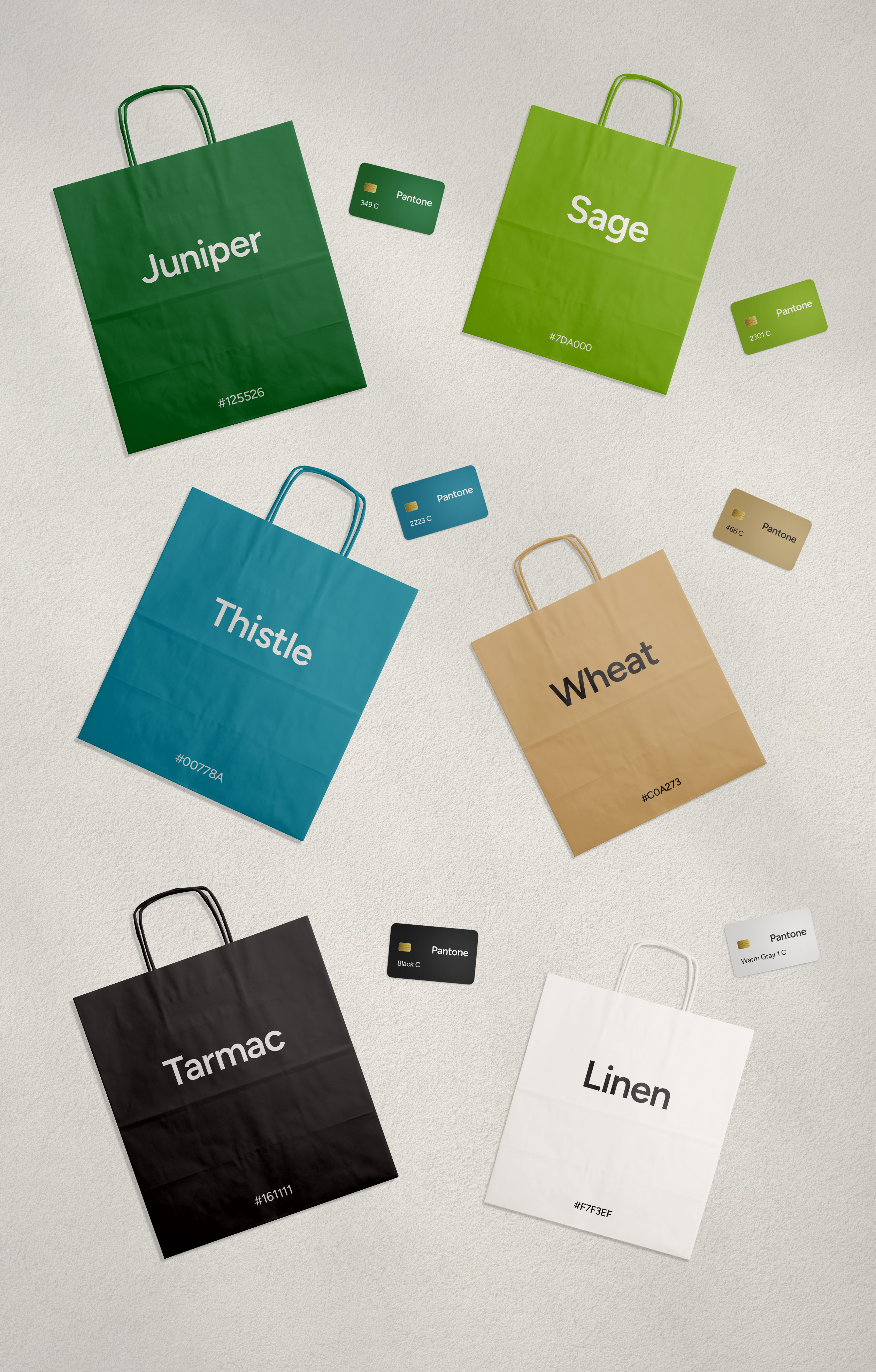
The colour palette draws directly from the landscape and everyday experience of Harbour Landing. Juniper anchors the brand as the primary green, grounded and unmistakably Saskatchewan. Sage introduces a brighter, high-contrast green for energy and emphasis, while Thistle reflects the blue tones of prairie summer skies. Wheat brings warmth inspired by surrounding fields and the neutral tones of the development’s architecture. Tarmac offers a rich black nodding to the expanses of parking and pavement that define the site, and Linen provides a soft off-white influenced by the apparel and lifestyle retailers within the centre. Together, the palette feels local, natural, and alive, reinforcing Grasslands as the natural place to shop, dine, and gather.


Lucas is an incredibly talented designer and a true artist, but what really sets him apart is how well he understands the why behind a brand. From the very first pitch, we could tell he was different. Even with minimal direction, he understood our situation immediately and went above and beyond anything we’ve experienced with other design firms.
We came to Lucas to help us reimagine our brands for Grasslands and Currents of Windermere, our major shopping centres in Regina and Edmonton. Lucas didn’t just design us a logo...he built out a full brand toolkit that allowed us to truly bring each brand to life. At every step, we were blown away by the level of thought, creativity, and storytelling he put into the work. We now have brands that genuinely resonate with our retailers and the public, and most importantly, feel authentic to who we are.


This was a large-scale project that pushed both strategy and creativity in equal measure, and one I genuinely enjoyed bringing to life. I’m thankful for the trust the Harvard Developments team placed in me, and grateful that our partnership has continued to grow beyond this rebrand.