
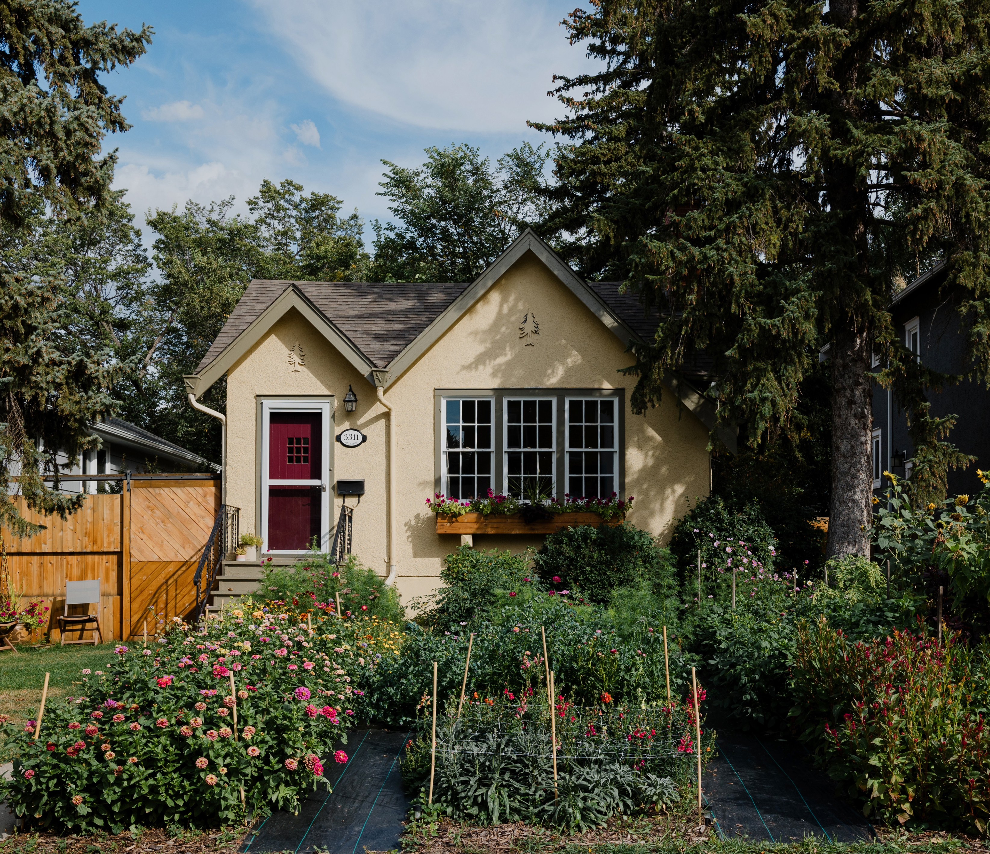
Garden Gables is a homegrown floral studio based in Regina, founded by Chantal Blaisdell and rooted quite literally in the front garden of her home. What began as a personal love for growing flowers slowly evolved into a floristry practice shaped by seasonality, care, and intention. Each arrangement reflects a quiet appreciation for what is fleeting, beautiful, and present.
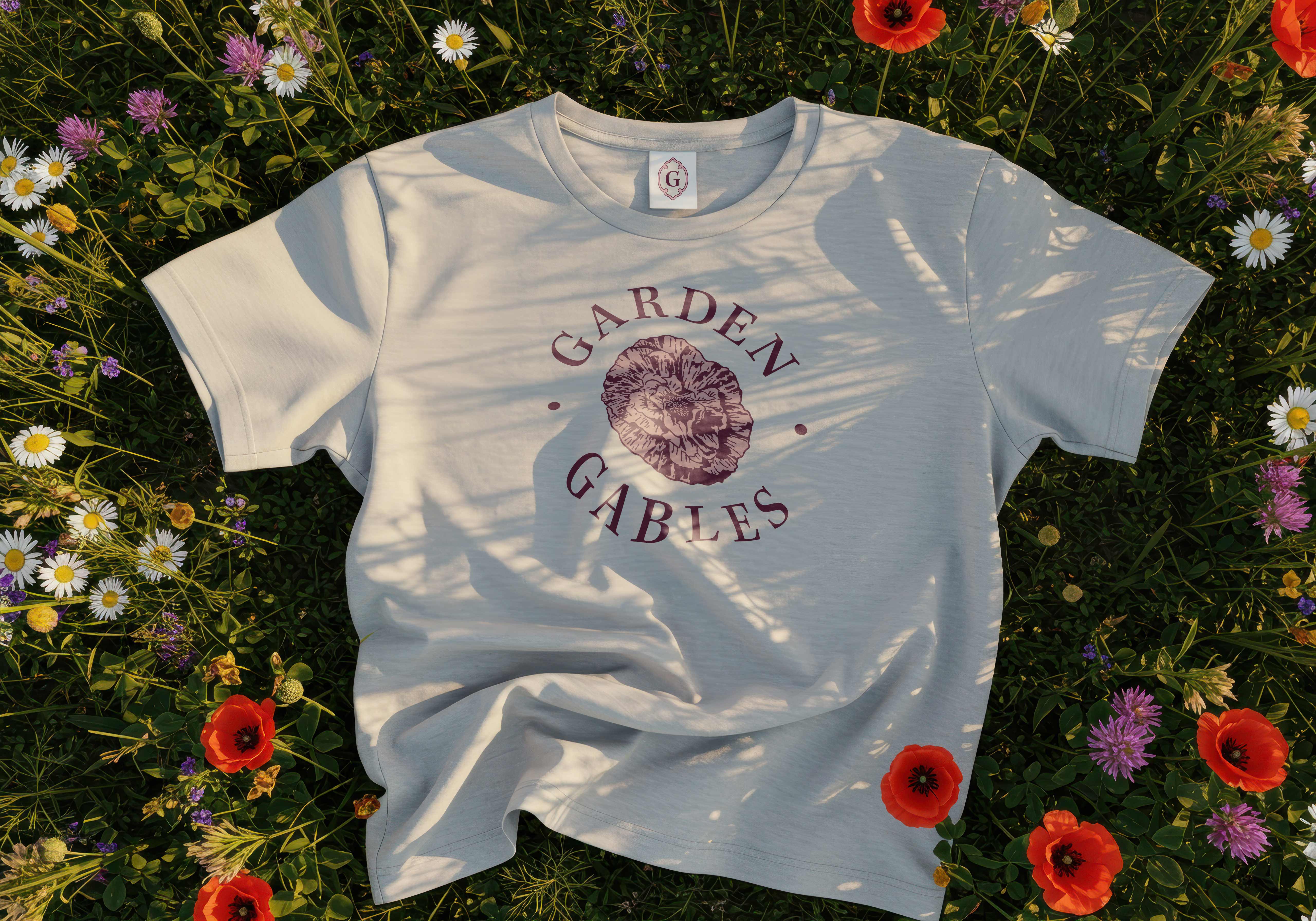
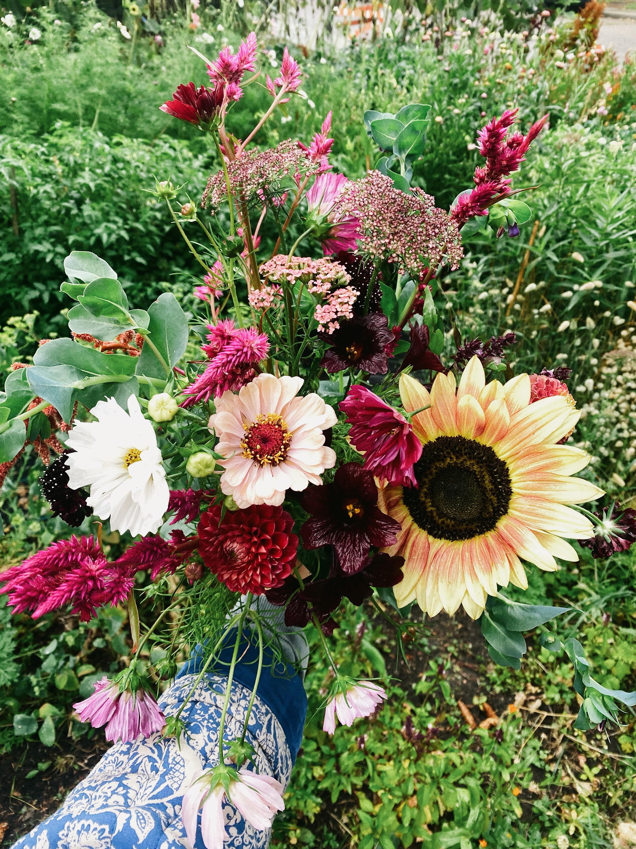
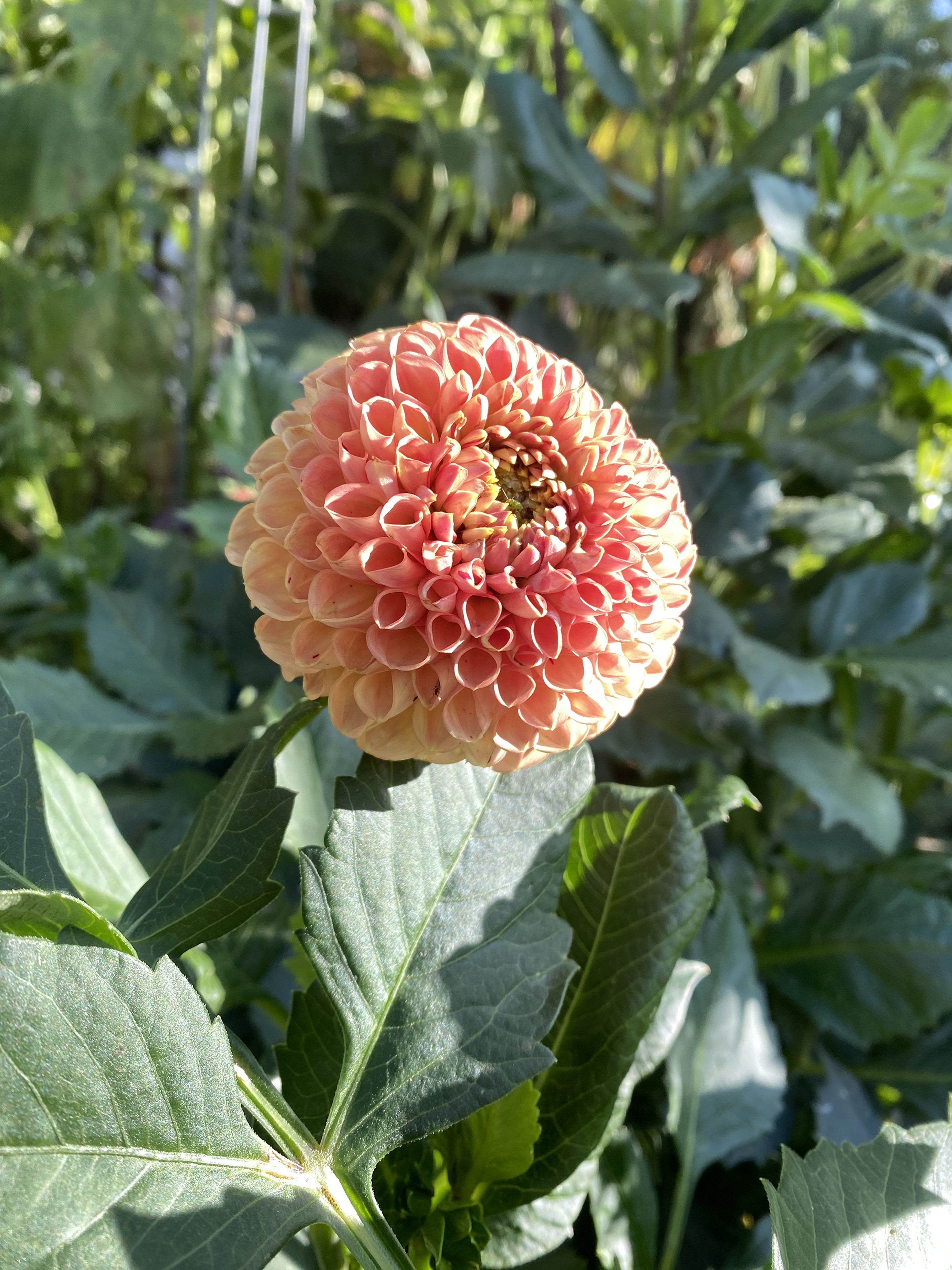
The poppy sits at the heart of the brand. Soft, delicate, and short-lived, it represents gentleness and strength existing side by side. For Chantal, the poppy is a reminder to slow down and notice small moments, a philosophy that carries through every bouquet. This meaning guided the visual identity, influencing both the tone of the brand and the details within it.
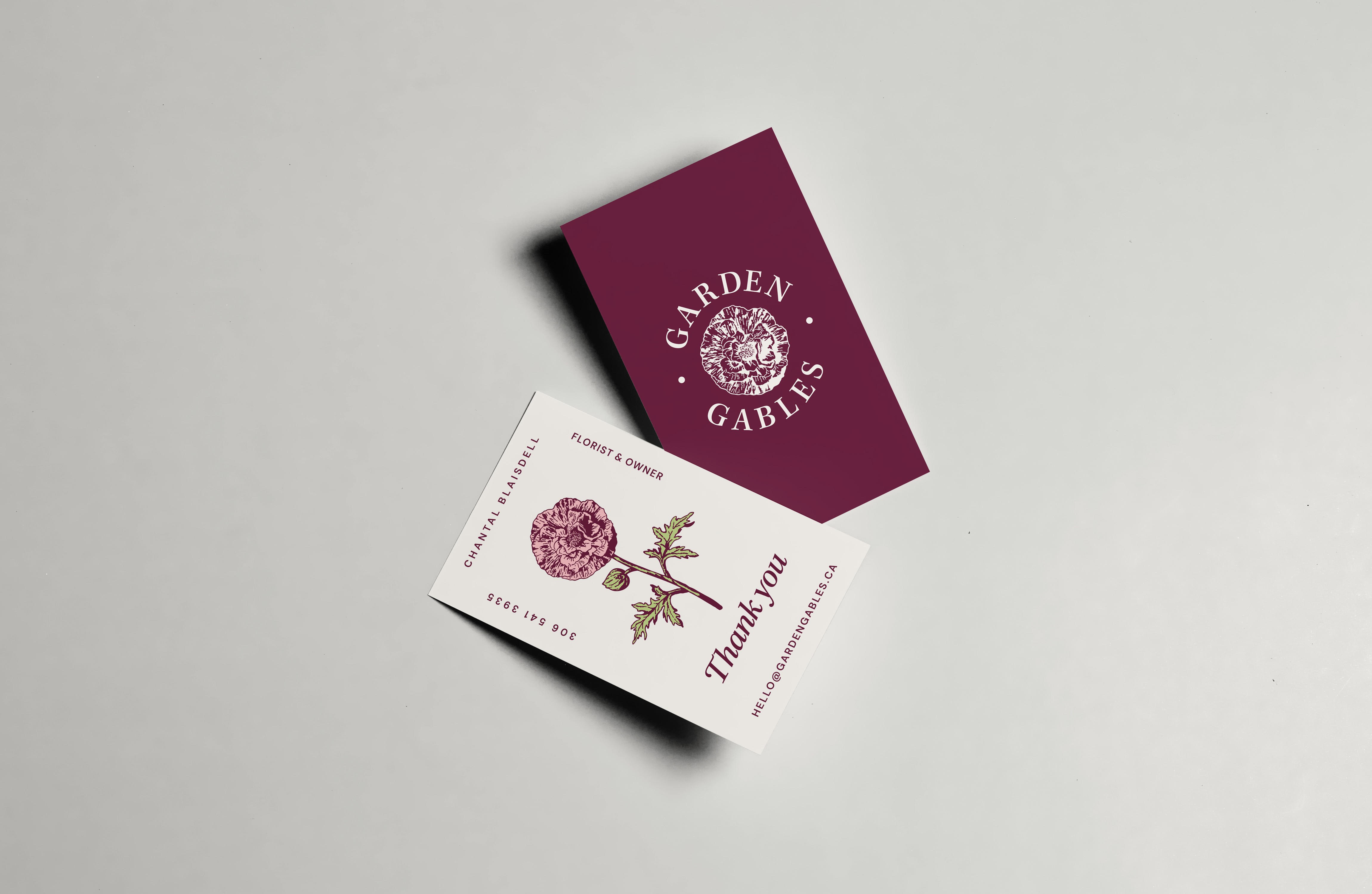
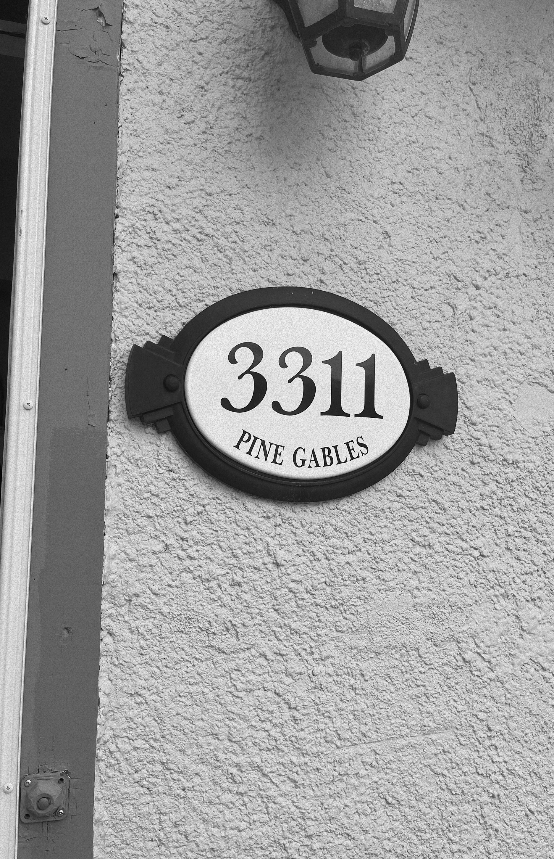
The identity draws inspiration from Chantal’s home and garden. A subtle flourish found beneath her poppy-shaped door handles informed a special ornamental “G” mark, used quietly throughout the brand as a nod to home. A custom crest was also developed, its shape inspired by the address plaque on the front of the house, Pine Gables. Together, these elements create an identity that feels personal, thoughtful, and deeply connected to where Garden Gables began.


I began the process with sketches after meeting with Chantal at her home, where every flower she sells is grown in her own front yard. Being in that space helped shape the direction early on. I explored a range of logo ideas centered around the poppy, which quickly emerged as the heart of the brand. Alongside the flower itself, I looked closely at the quiet details around her home, drawing inspiration from the shape of her doorknobs, the address plaque, and subtle flourishes found in the eaves and hardware. These elements informed the sketches, helping form an identity that feels personal, rooted, and closely tied to the place where Garden Gables began.

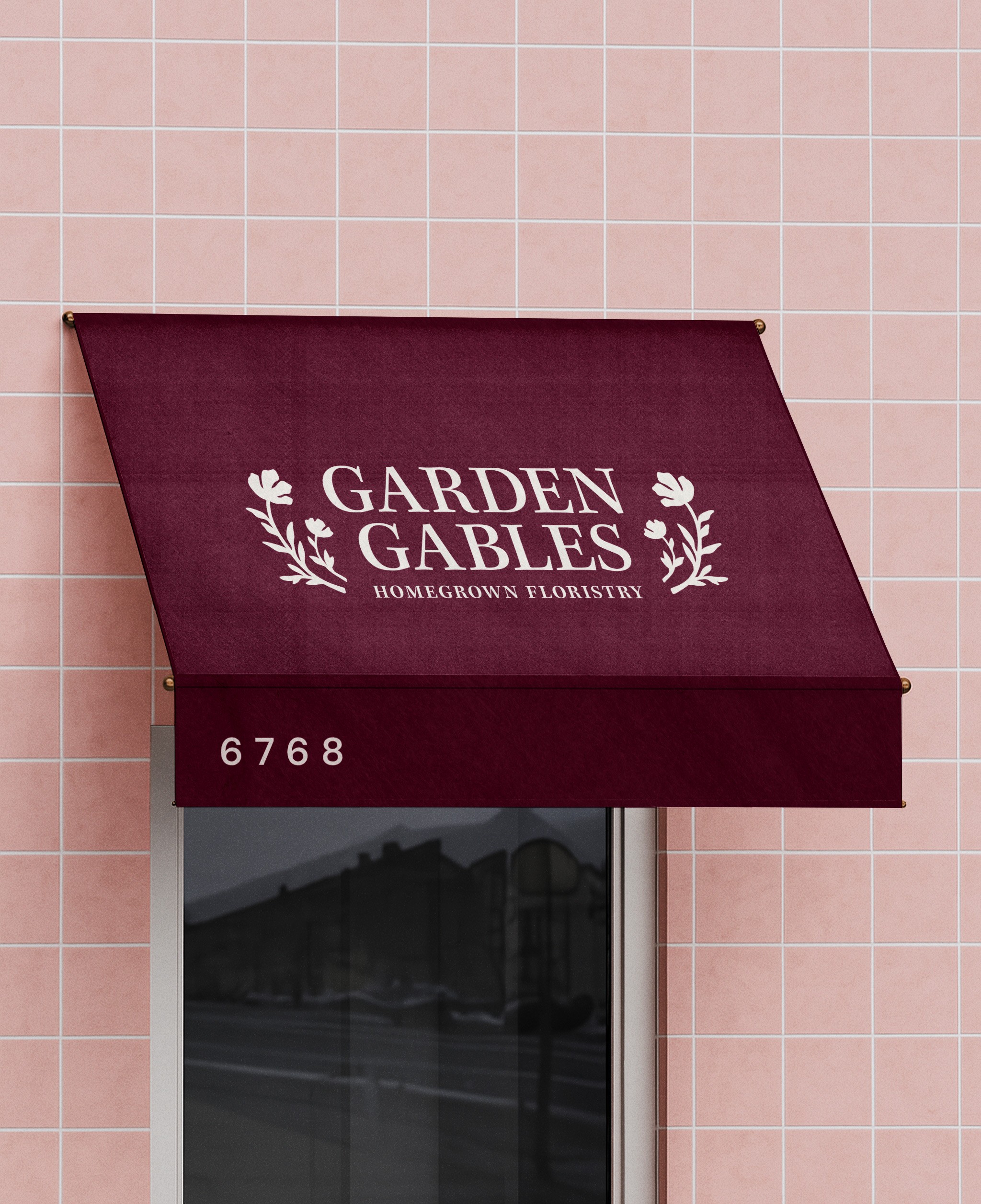
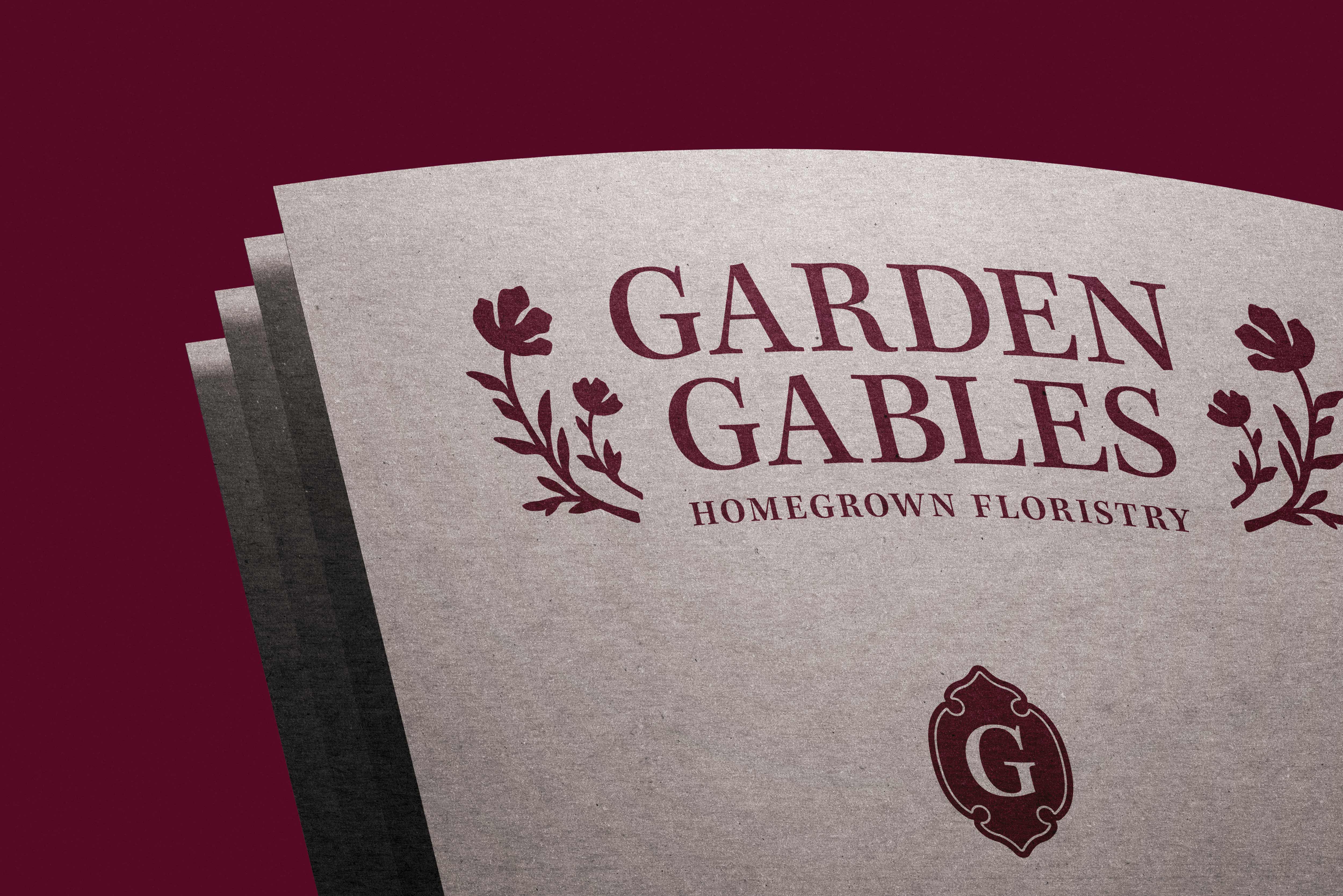
The Garden Gables wordmark brings the full name together with hand-drawn floral flourishes that frame the lettering and create a sense of balance. A large bloom paired with a smaller flower reflects the natural rhythm of the garden, where not everything grows the same, but everything belongs. The result is a mark that feels warm, intentional, and rooted in care, capturing the quiet beauty and thoughtfulness behind every arrangement.


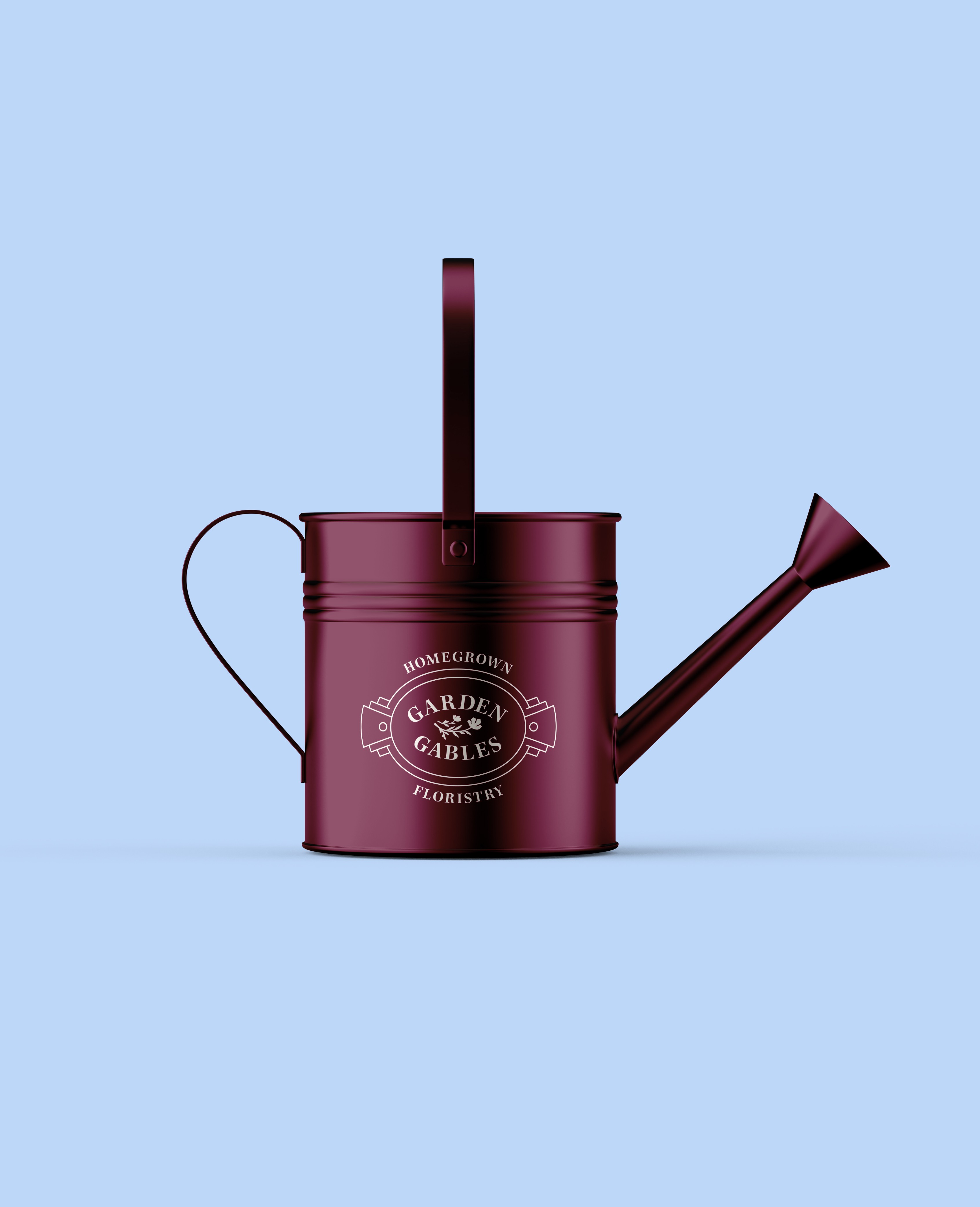


A collection of supporting marks was developed to bring depth and flexibility to the Garden Gables identity, each one drawn directly from details found around Chantal’s home. A plaque-style crest was inspired by the shape of the address sign on her house, grounding the brand in a sense of place and origin. A standalone “G” mark sits within a soft ornamental frame, echoing the delicate flourishes found at the base of her door handles. The poppy symbol was also expanded into a full-colour illustration, showing the complete stem and bloom in brand colours. Together, these marks create a cohesive visual system that feels personal, intentional, and rooted in the spaces where Garden Gables first took shape.


The Garden Gables identity is built around warmth, intention, and a deep connection to homegrown floristry. Typography is led by Kepler Std, an elegant serif chosen for its timeless, editorial quality. Its graceful forms feel reminiscent of vintage flower books and classic garden journals, lending the brand a sense of care, craft, and quiet romance. Kepler is paired with DM Sans, a clean and contemporary sans serif used for contrast and clarity, ensuring the system remains approachable and highly legible across packaging, signage, and digital touchpoints.
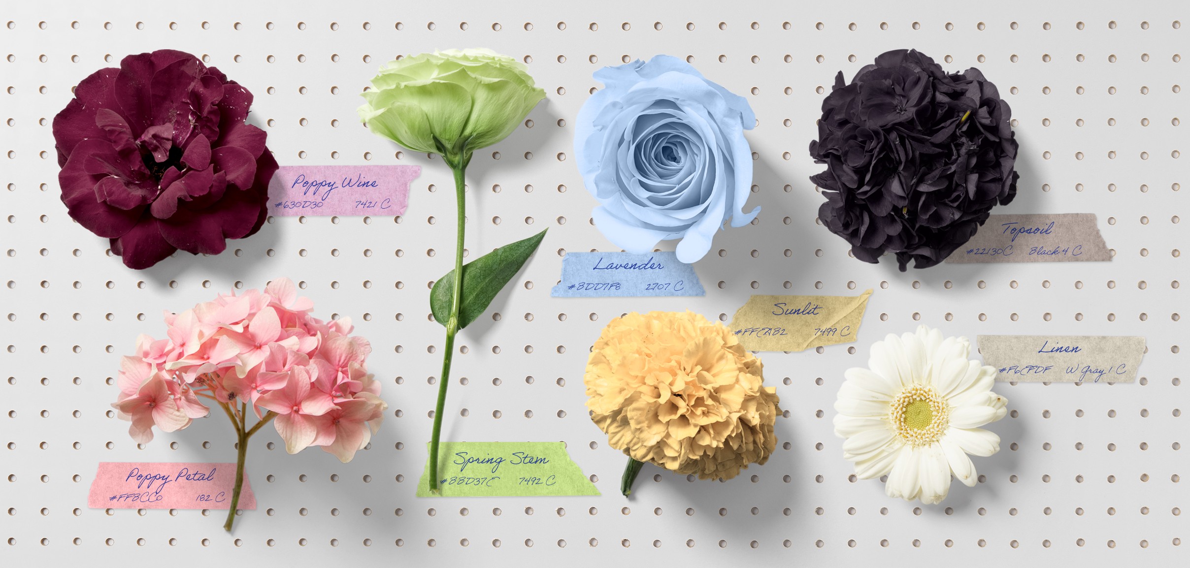
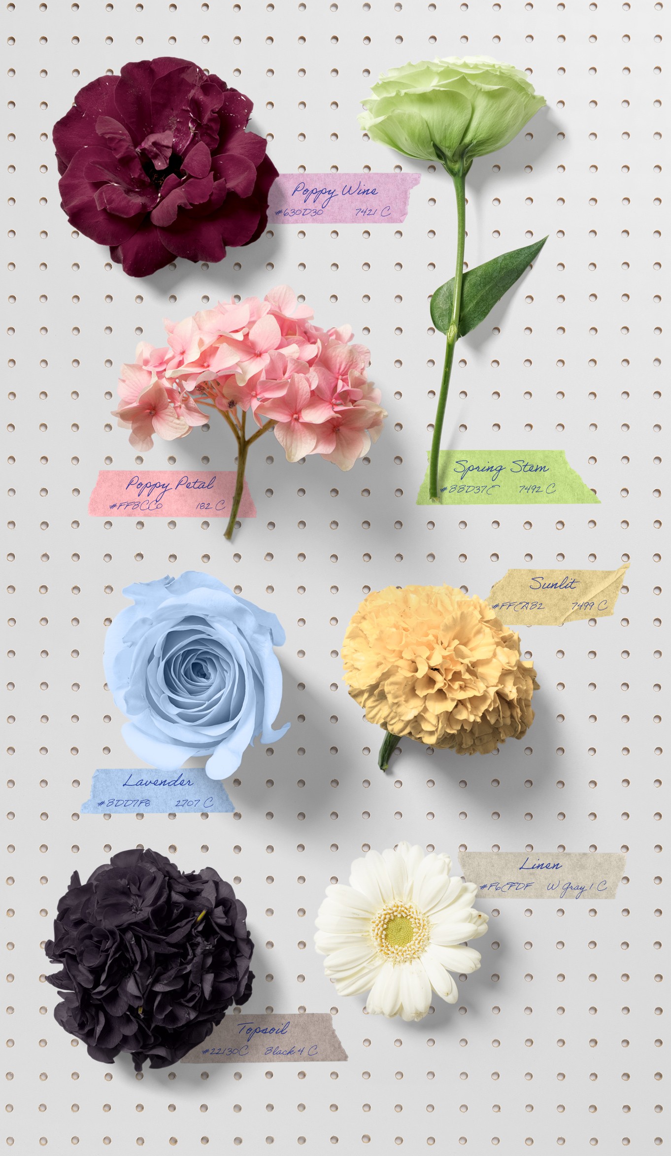
The colour palette draws directly from Chantal’s home and the natural rhythms of the garden through spring and summer. Poppy Wine anchors the brand, inspired by the deep tone of the doors on her house and garage, while Poppy Petal adds a soft, light contrast. Spring Stem introduces a grounded green tied to growth and foliage, with Lavender offering a gentle complementary note. Sunlit reflects the exterior of Chantal’s home, and Topsoil and Linen round out the palette with a rich black and warm off white that bring balance, depth, and a sense of lived-in beauty.


The brand identity and ideas Lucas brought to life for my little company, Garden Gables, have far exceeded anything I could have imagined. Lucas’ work has captured every single element I had hoped could be conveyed into beautiful, tailored and timeless designs. Lucas is endlessly creative, professional, knowledgeable and a truly wonderful person to work with. I recommend Lucas at every opportunity I get because he truly is hands down, the best


This project was especially meaningful to work on. Chantal’s care, taste, and trust made the process feel personal, collaborative, and deeply rewarding.